Skincare Packaging Project Case Studies
See how LumLun approaches SKU coordination, retail-ready product lines, and refillable airless packaging through clear project decisions—not generic packaging claims.
Every project still requires confirmation against the selected model, decoration, order quantity, target market and actual formula.
What These Case Studies Are Designed to Show
The strongest packaging project is not simply the most decorative option. It is the direction that fits the product structure, order plan, visual system, sales channel and formula requirements without creating avoidable complexity.
Coordinating Two Cosmetic Tube SKUs Without Splitting the Brand System
The project direction focused on keeping two products visually distinct while preserving enough shared packaging conditions to support a more practical production discussion.
Two Attractive Products, but Not Yet One Product Family
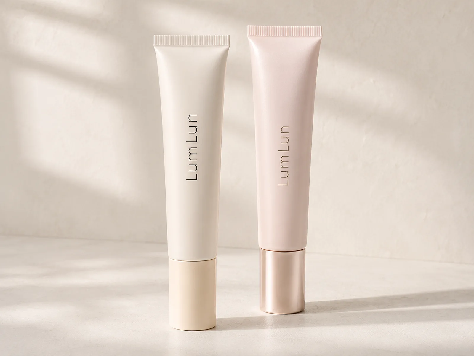
The first direction used different tube colors and different cap finishes. Each SKU looked complete on its own, but the pair did not immediately read as one coordinated skincare line.
- Body colors created a larger visual gap between the two SKUs.
- Different cap finishes added another production and visual variable.
- The brand still needed clear Day/Night or formula differentiation.
- The packaging structure had to remain realistic for the selected tube model.
Shared Packaging Language With Controlled SKU Differentiation
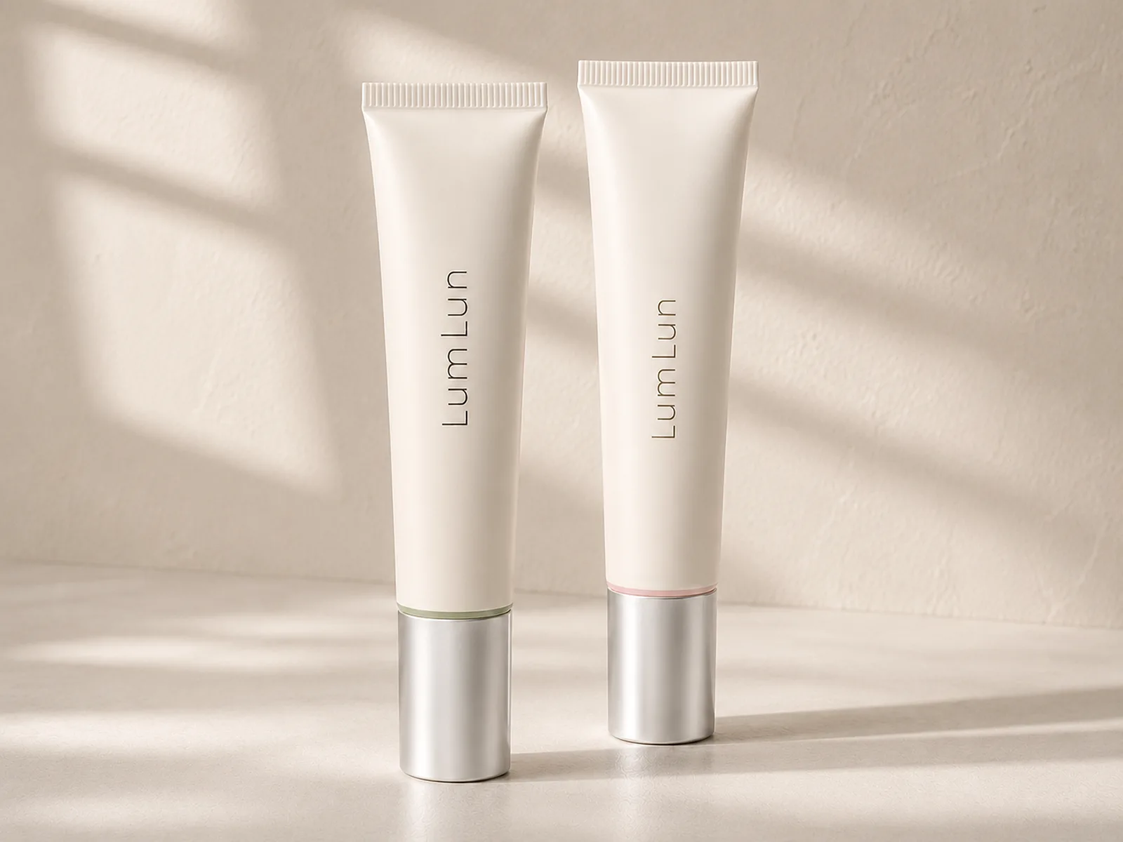
The refined direction unified the main tube body, cap finish and logo treatment. SKU distinction moved to smaller color accents and printed information rather than changing the complete packaging identity.
- One shared body-color direction supports stronger shelf consistency.
- Matching caps reduce unnecessary visual fragmentation.
- Small color accents can distinguish formulas without redesigning the full pack.
- Final combination feasibility still depends on the selected tube, resin, diameter and production conditions.
What This Case Demonstrates
A coordinated two-SKU system can reduce avoidable design and production complexity when the SKUs share the correct technical conditions. It does not mean every two products can automatically be divided below the standard MOQ. The final production plan must be confirmed before quotation.
Turning Three Primary Packs Into One Coordinated Skincare Packaging System
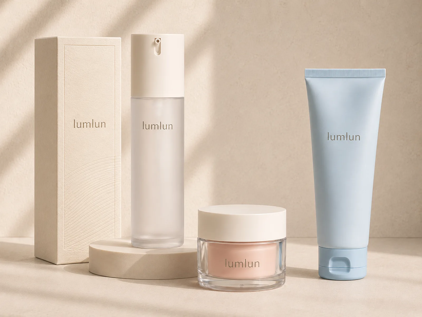
This project direction moved from individual primary-pack choices to a coordinated system suitable for product pages, retail display and boxed presentation.
Confirming the Core Containers Before Extending the Brand System
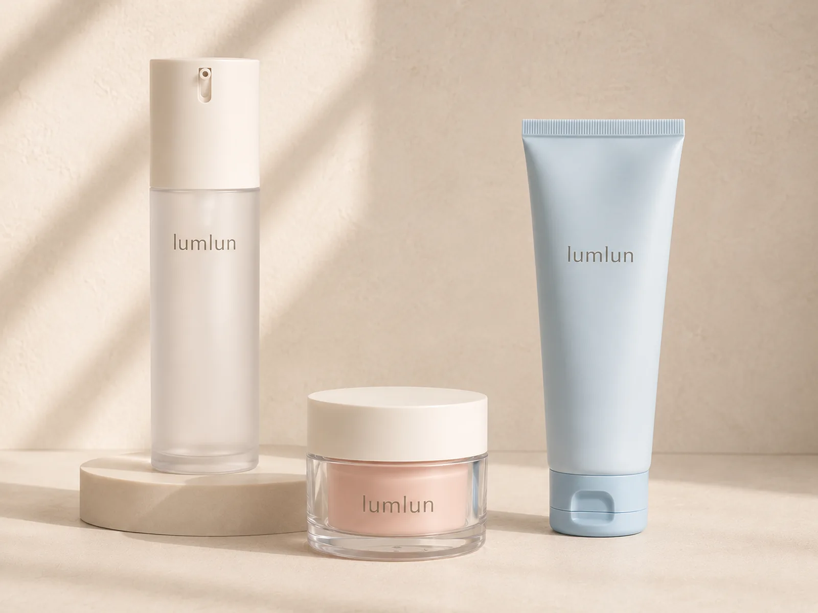
The first decision was whether the three primary packs could feel related while retaining their correct structures, proportions and dispensing functions.
- The pump bottle, jar and tube needed one shared visual hierarchy.
- Each format still had to preserve its real closure, pump and wall structure.
- Soft neutral colors created a flexible base for skincare positioning.
- The image represents a design direction, not proof of PCR, biobased content or certification.
Extending the Visual System Into Secondary Packaging
The second direction added a coordinated paper box without changing the primary-pack structures. The objective was to help the line look complete across ecommerce photography, retail display and gift-set presentation.
- Shared logo scale and placement improve immediate brand recognition.
- A controlled color hierarchy prevents the product line from looking fragmented.
- The box introduces more room for brand information and retail presentation.
- FSC paper, PCR content or other material claims should only be used when supported by the selected supplier documents.
What This Case Demonstrates
Coordinated packaging is not achieved by making every container identical. It is achieved by controlling color, logo placement, finish language and secondary packaging while preserving the correct function and structure of each packaging format.
Evaluating a Refillable Airless System for Formulas Sensitive to Repeated Air Exposure
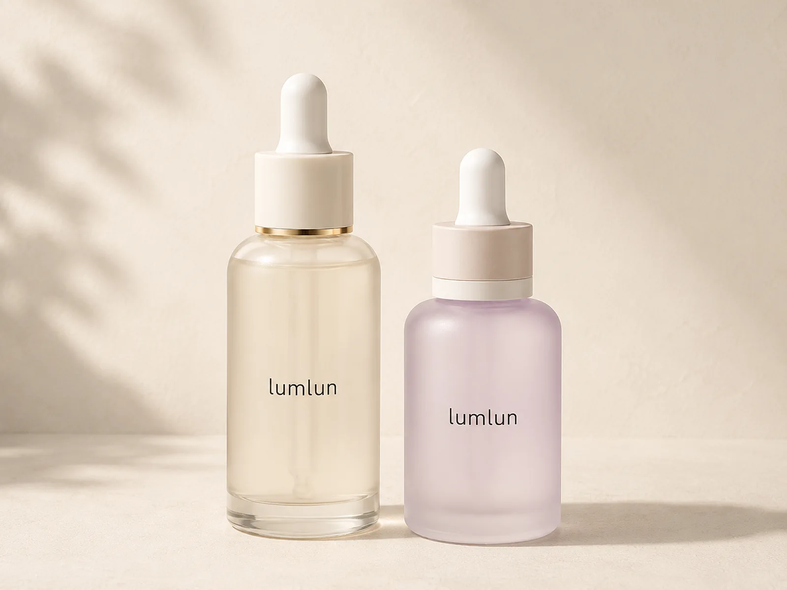
The project comparison moved from a premium dropper-bottle direction to a refillable airless format when the brand wanted controlled dispensing, reduced repeated air intake and a replaceable inner-bottle concept.
Premium Appearance Was Not the Only Decision
Glass dropper bottles can provide strong visual weight and a premium skincare presentation. The format still needs to match the actual formula, dosing expectation, transport conditions and the brand’s preferred user experience.
- Droppers are generally more suitable for lower-viscosity formulas.
- The pipette, gasket, bulb material and neck fit must work together.
- Repeated opening and closing may not match every formula-protection strategy.
- Premium appearance alone does not determine packaging suitability.
Separating the Reusable Outer Pack From the Replaceable Inner Bottle
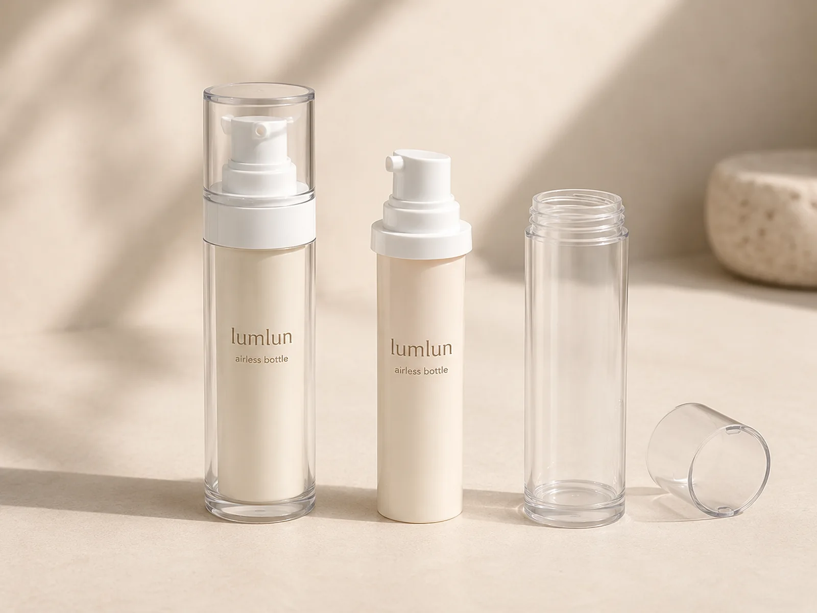
The alternative direction used an airless dispensing structure inside a reusable outer package. The refill logic was designed around replacing the inner bottle rather than replacing the complete decorated pack.
- The airless pump supports controlled dispensing and reduced repeated air intake.
- The decorated outer shell can remain in use while the inner bottle is replaced.
- The component view makes the refill structure understandable to buyers.
- The selected inner bottle, pump output and formula still require compatibility testing.
What This Case Demonstrates
The correct decision is not “dropper bottle versus airless bottle” in isolation. The decision should follow the formula, dispensing target, refill strategy, transport requirements and the experience the brand wants customers to have.
From Packaging Direction to Production-Ready Decisions
A strong packaging proposal should make the next decision easier—not add more decorative options without technical boundaries.
Clarify the Product Goal
Review formula type, target market, sales channel, positioning, required capacity and dispensing expectation.
Match the Structure
Compare bottle, jar, tube, pump, dropper and refill structures against the product’s practical requirements.
Build the Visual System
Coordinate colors, logo placement, surface finishes and paper boxes without distorting the real product structure.
Confirm Before Production
Review samples, decoration, formula compatibility, order quantity, documentation and production timing before approval.
What Buyers Usually Need to Confirm Next
Can two cosmetic tube SKUs share one production direction?
Potentially. Feasibility depends on whether the SKUs can share the same tube diameter, material, body color, cap structure and compatible production conditions. Final MOQ allocation must be confirmed before quotation.
Does an airless bottle suit every skincare formula?
No. Pump output, formula viscosity, seal compatibility, outlet design and selected material must be tested with the actual or closest formula before production.
Can bottles, jars, tubes and paper boxes use one coordinated design system?
Yes. A shared color hierarchy, logo position and finish language can connect different packaging formats while each product keeps its correct structure and proportions.
Are sustainability claims automatically included with the design?
No. PCR content, biobased material direction, FSC paper and other claims depend on the selected material, supplier documentation and target-market requirements.
Build a Packaging System That Fits the Product and Helps the Brand Sell More Clearly
Share the product type, target capacity, formula direction, market and visual reference. LumLun can help compare suitable packaging structures and customization directions before sampling.
Discuss Your Packaging Project