Last Updated: July 2026
Before a customer tries the formula, your packaging finish has already started shaping the sale. In a product photo, on a retail shelf, inside a buyer presentation, or in a social post, the finish is one of the first signals people use to judge whether a skincare product feels premium, trustworthy, clean, and worth picking up.
That is why cosmetic packaging finishes should not be treated as the final decoration step. They help shape first impressions, support price perception, carry brand identity, and make the product easier to understand before the customer ever presses the pump, opens the cap, or touches the formula.
The right finish is not always the most expensive one, the most complex one, or the one another brand is using. It is the one that fits your brand positioning, packaging format, SKU plan, information needs, and selling channel. A clinical skincare line, a clean beauty brand, a premium anti-aging range, and a youth-focused serum collection may all need different finish choices.
This article helps skincare brands choose packaging finishes with a commercial mindset. Instead of asking which finish is “best,” it looks at which finish helps your product attract attention, communicate clearly, stay clean-looking through handling, feel valuable, and support better buying decisions.
Key Takeaways
- Cosmetic packaging finishes affect how skincare products are judged before the formula is tried. The finish helps shape first impressions, trust, and perceived value.
- The right finish should support the brand signal, not just look attractive. Clinical, premium, clean beauty, spa-like, and youth-focused products need different visual language.
- Matte, frosted, glossy, and soft-touch finishes create different expectations. Each finish changes how the package looks in photos, on shelves, and in the customer’s hand.
- Screen printing, labels, and hot stamping solve different packaging communication problems. They should be chosen by selling role, not habit.
- A finish system across the full product line is more valuable than one beautiful package. Consistency helps the brand look easier to recognize, trust, and expand.
Why Cosmetic Packaging Finishes Matter Before Customers Try the Formula
Cosmetic packaging finishes matter because customers judge skincare products visually before they ever test the formula. They see the surface, color, shine, logo, label, and overall balance first. Only after that do they decide whether to read the claims, check the ingredients, compare the price, or move on.
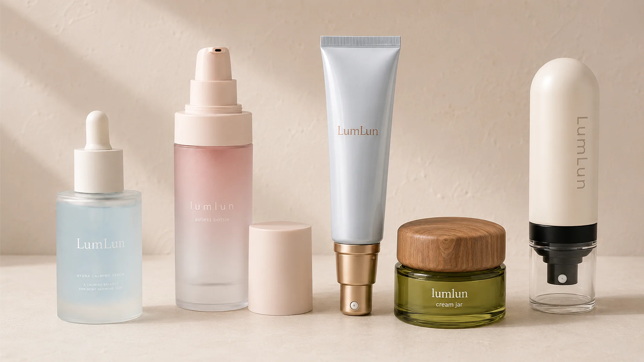
This is true online and offline. In an online store, a product thumbnail has only a few seconds to earn attention. A frosted serum bottle, a clean matte airless bottle, or a glossy color-coded tube can all send different signals before the product page is opened. On a shelf, the same finish can help the product feel clinical, premium, natural, fresh, or more price-accessible.
For skincare brands, this matters because packaging is often the first proof of positioning. A formula may be strong, but if the finish looks random, crowded, or mismatched, the product can feel less valuable than it really is. A well-matched finish does not sell the product by itself, but it helps the customer believe the product is worth noticing.
The finish should help the product win more attention before the formula is tested, communicate the brand promise faster, stay clean-looking through handling, and make the product line easier to recognize across future SKUs.
The goal is not to make every package look expensive. The goal is to make the finish match what the product is trying to sell. A minimalist clinical serum should not look like a colorful youth cleanser. A premium anti-aging cream should not feel unfinished. A clean beauty line should not look visually heavy if the brand promise is calm and simple.
Which Packaging Finish Matches Your Skincare Brand Positioning?
The right packaging finish is the one that makes your skincare brand look like the promise it is selling. Before choosing matte, frosted, glossy, soft-touch, screen printing, labels, or hot stamping, start with the brand signal you need customers to feel first.
| Brand Positioning | What Customers Should Feel | Better Finish Direction |
|---|---|---|
| Clinical skincare | Precise, clean, reliable | Matte, frosted, clean screen printing |
| Premium anti-aging | Refined, high-value, controlled | Hot stamping, metallic accents, deep matte, soft-touch |
| Clean beauty | Calm, simple, natural | Muted matte, frosted, minimal decoration |
| Youth-focused skincare | Fresh, bright, social-friendly | Glossy surfaces, stronger color contrast, decorative labels |
| Spa-like skincare | Soft, calming, sensory | Frosted, soft-touch, warm neutral colors |
Packaging decision: Choose the finish that supports your skincare brand position first, then adjust color, decoration, and information layout around that signal.
When brands skip this step, they often choose finishes by preference or trend. The package may still look attractive, but it may not support the product’s selling role. A good finish should help the customer understand the product faster: what it is, who it is for, and why it feels worth trying.
Matte, Frosted, Glossy, or Soft-Touch: Which Finish Fits Your Product?
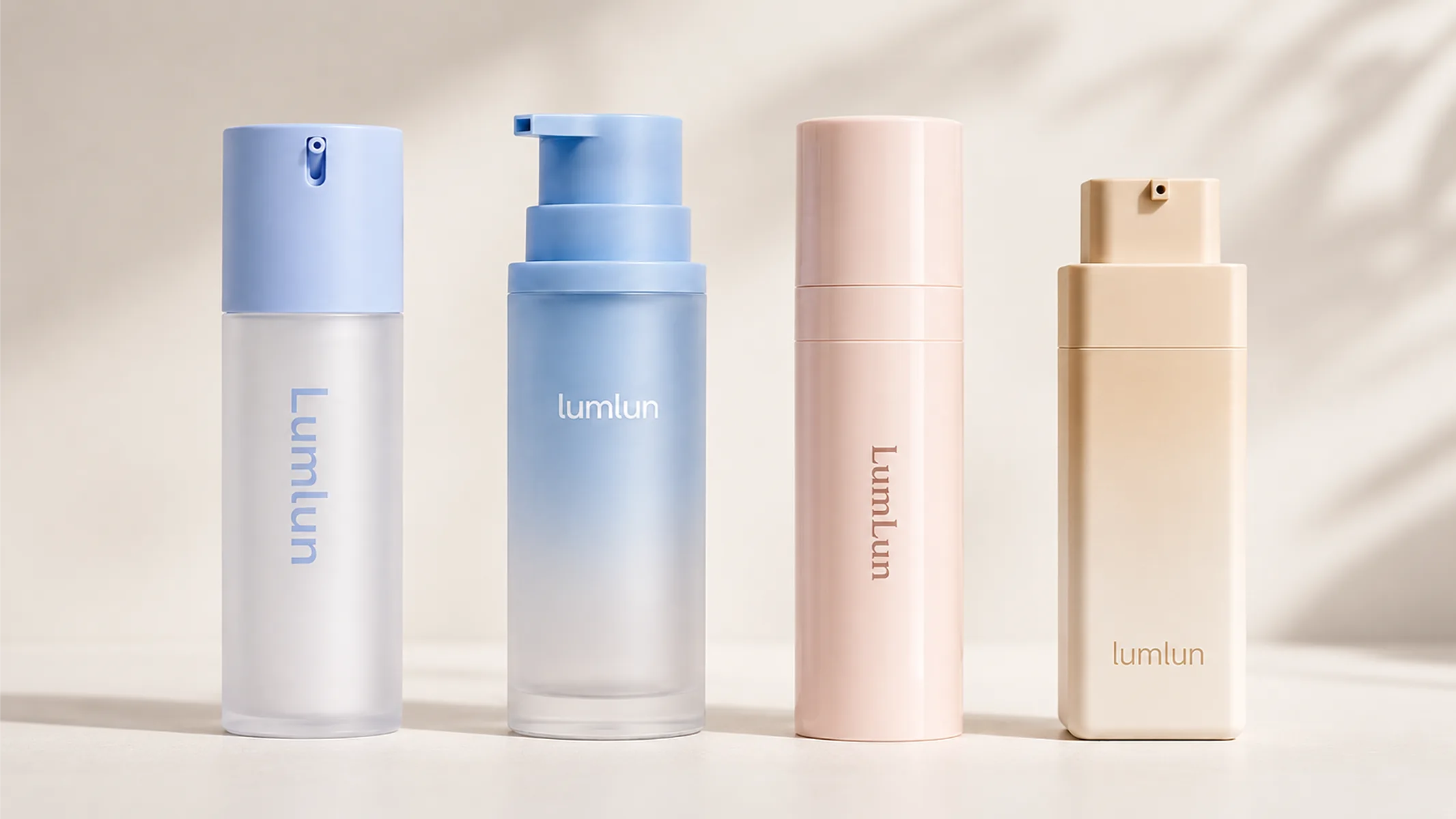
Matte, frosted, glossy, and soft-touch finishes can all work for skincare packaging, but they create different expectations before the product is used. The right choice depends on what you want customers to feel first.
Matte finishes usually suit brands that want a controlled, modern, and quietly premium look. Matte can reduce glare, soften the visual tone, and make the package feel more professional. It works especially well for clinical skincare, minimalist clean beauty, and premium daily-use products that should feel serious without looking cold.
Matte also needs real sample confirmation. A deep matte surface can look beautiful in a rendering, but it may show fingerprints, dust, or handling marks depending on color, coating, and daily use. That does not make matte a poor choice. It simply means the finish should be checked on the actual container before full production.
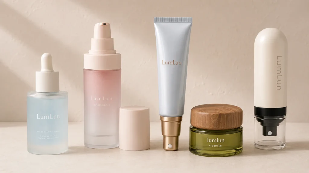
Frosted finishes are often used when a brand wants softness, translucency, and a refined skincare feel. They work well on serum bottles, airless bottles, jars, and other packages where the product needs to feel clean but not plain. Frosted packaging can keep a sense of lightness while making the surface feel more polished than a fully clear glossy pack.
Glossy finishes make colors look brighter and more energetic. They can be useful for youth-focused skincare, color-coded product lines, fresh facial mists, or products designed to stand out in thumbnails and social content. Glossy packaging can create stronger visual impact, but brands should check reflections and photo performance because glare can change how the package appears under different lighting.
Soft-touch finishes add a tactile layer. They can make a bottle, tube, or jar feel smoother and more memorable in hand. This is especially useful for premium clean beauty, anti-aging ranges, giftable skincare, or any product where the brand wants a more sensory, refined experience. The key is balance: the touch should support the brand, not distract from the message.
Selling value: A finish should not only look good in a product photo. It should also stay clean-looking after handling. Some matte, frosted, or soft-touch surfaces can reduce the visibility of fingerprints, smudges, and glare compared with very glossy finishes, but the final result should always be tested on the real container.
Screen Printing, Labels, or Hot Stamping: Which Decoration Method Should You Choose?
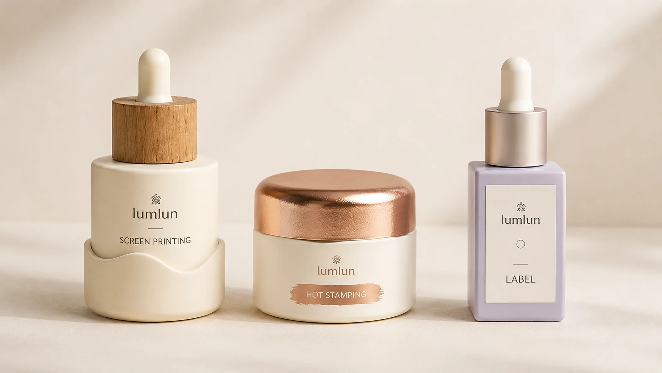
Screen printing fits stable brand identity, labels fit flexible information, and hot stamping fits controlled premium accents. These methods should not be judged as better or worse in general. They solve different packaging communication problems.
| Method | Best Selling Role | Better Fit |
|---|---|---|
| Screen printing | Stable front identity | Clean logo, repeat SKU, integrated look |
| Labeling | Flexible information | Multi-SKU, multi-language, ingredients, claims |
| Hot stamping | Premium accent | Logo, hero product name, high-value line |
| Mixed decoration | Balance beauty and information | Clean front, detailed back label or carton |
Screen printing is often the right choice when the front of the package should feel clean and integrated. It suits brands with stable artwork, repeat SKUs, and simple logo systems. The customer sees the branding as part of the package, not something added later.
Labels are often better when the brand needs flexibility. A label can carry longer information, multiple languages, changing claims, product variations, and market-specific text. For brands expanding from one SKU to a full line, labels can help keep information clear without overloading the front visual.
Hot stamping works best when used with control. A small metallic logo, product name, or series mark can make the package feel more valuable. Too much metallic decoration can feel crowded or less refined, so the strongest use is often selective and intentional.
Many skincare brands do not need to choose only one method. A clean front with screen printing, a small premium accent with hot stamping, and detailed information on a label or carton can create a stronger balance than forcing everything onto one surface.
Not sure which cosmetic packaging finish fits your skincare brand? Send what you already have — product type, artwork, reference image, or target market — and LumLun can help narrow down the right finish options before sampling and full production.
Which Finishes Work Well for Bottles, Tubes, Jars, and Airless Packaging?
The same finish does not perform the same way on bottles, tubes, jars, and airless packaging, so brands should match the finish to the packaging format. A surface that looks refined on a jar may need to be adjusted for a squeeze tube. A clean front print that works on an airless bottle may not provide enough information space for a multi-language product.
| Packaging Type | Finish Goal | Practical Direction |
|---|---|---|
| Serum bottle | Clean, active-led, premium | Frosted or clear body, clean print, small metallic detail |
| Cosmetic tube | Clear, durable, easy to read | Matte, glossy, screen print, offset print, label |
| Cream jar | Substantial, premium, giftable | Decorated cap, matte or frosted body, controlled side information |
| Airless bottle | Hygienic, technical, high-value | Clean print, premium shell finish, minimal front branding |
| Fine mist bottle | Fresh, light, clean | Transparent or frosted body, clean front branding |
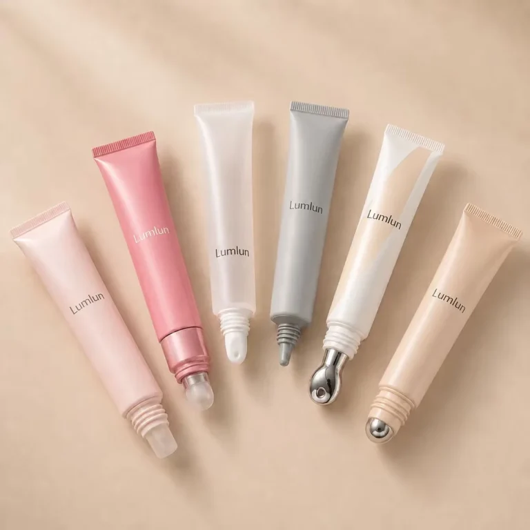
| Lip serum tube | Small but memorable | Small logo, applicator-led visual, metallic accent |
This is why finish decisions should happen together with packaging format decisions. The finish does not sit on top of the container as a separate choice. It has to work with the shape, surface, cap, label area, and how the customer will handle the product.
For example, a custom cosmetic tube needs decoration that remains readable after squeezing, while a custom airless bottle usually needs a cleaner front system that supports a hygienic, technical, and high-value impression. If you are still deciding the bottle structure itself, our custom airless pump bottle guide goes deeper into airless packaging decisions.
What Finish Mistakes Make Skincare Packaging Look Less Valuable?
Most finish mistakes happen when brands choose decoration for appearance alone instead of testing how it supports the product’s price, clarity, and real-use experience. A package can look attractive in a mockup and still feel wrong once it becomes a real bottle, tube, or jar.
The most common mistake is using too many effects at once. Matte, gloss, metallic accents, gradients, heavy text, and strong color contrast can all work separately, but when they compete on the same front panel, the product can lose focus. A premium finish should create clarity, not noise.
Another mistake is choosing a finish that does not match the brand position. A clinical line can feel less trustworthy if the decoration is too flashy. A premium anti-aging jar can feel underpowered if the cap, logo, and finish do not support the price point. A clean beauty line can lose its calm feel if the finish is too shiny, crowded, or visually heavy.
Labels also need careful attention. A visible label edge, poor fit on a curved surface, or unclear information layout can weaken the premium impression. For transparent bottles, back-side text can sometimes show through the front and disturb the clean look. For cosmetic tubes, brands should check how the decoration looks after the tube is squeezed, because the real-use experience can change the visual result.
Before full production: Do not approve a finish only from a digital mockup. Check color, touch, label fit, print clarity, fingerprints, smudges, and real-use handling on the actual container.
These are not reasons to avoid any finish. They are reasons to test finishes properly. A good packaging supplier should help you check how the finish behaves on the real container, not only how it looks in a digital artwork file.
How Much Space Should Packaging Leave for Claims, Ingredients, and Market Information?
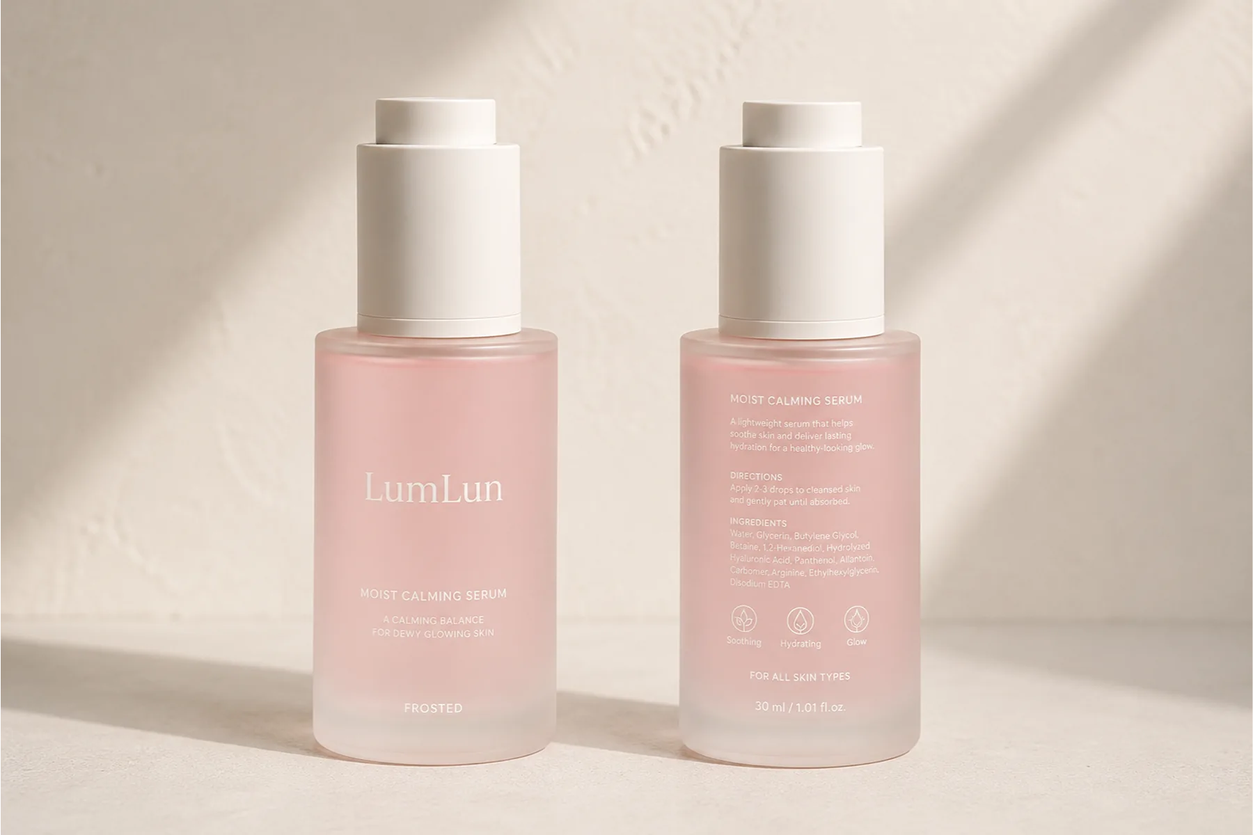
Skincare packaging should leave enough space for clear product information because the finish has to support both visual appeal and market-ready communication. A beautiful front panel is not enough if the customer cannot understand what the product is, how to use it, or why it fits their needs.
For skincare brands selling across different markets, information space becomes even more important. Product identity, net content, ingredient information, warnings where needed, company details, usage directions, claims, batch information, and market-specific language may all need to be considered. The exact requirements depend on where the product is sold, so brands should review local regulations and professional compliance advice before launch.
For example, the FDA cosmetic labeling requirements explain how labeling rules affect cosmetics sold in the United States, while the EU Cosmetics Regulation includes requirements related to product responsibility and traceability. This article is not legal advice, but it is a reminder that finish choices and information layout should be planned together.
From a packaging design point of view, the important lesson is simple: do not force every message onto the front. The front can carry the brand promise and main product identity. The side, back, label, carton, or insert can carry longer information more clearly. This keeps the packaging attractive without sacrificing readability.
How Do You Build One Finish System Across a Full Skincare Line?
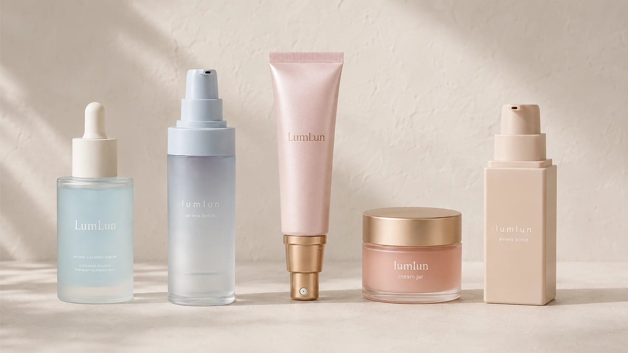
A finish system helps different skincare formats look like one brand, even when the line includes bottles, tubes, jars, and airless packaging. This is more valuable than making one package look good in isolation.
Most skincare brands expand. A brand may start with one serum, then add a cream, cleanser, mist, eye product, sunscreen, lip treatment, or travel size. If every product uses a different finish language, the line can start to feel disconnected. Customers may not immediately understand that the products belong together.
A stronger approach is to build a finish system. That can mean consistent logo placement, a controlled color palette, repeated use of matte or frosted surfaces, a shared metallic accent, or a clear difference between base products and premium products. The system should be flexible enough to work across bottles, tubes, jars, and airless packaging without making every SKU look identical.
Brand value: A finish system helps future SKUs look connected, which makes the skincare line easier to recognize, trust, and expand.
This matters for sales because a product line that looks consistent is easier to recognize. It also helps future launches. When the finish system is already clear, new products can join the range without starting the visual language from zero.
What Should You Test Before Approving Cosmetic Packaging Finishes?
Before approving cosmetic packaging finishes, brands should test the real container, real color, real surface, and real-use conditions instead of relying only on digital mockups. A finish choice is not complete until it works on the actual packaging.
Start with color. Pantone references are useful, but the final color can look different on PP, PET, PETG, PE tube material, coated surfaces, frosted finishes, or glossy finishes. Check the color under realistic light, not only under studio light.
Then check placement. Curved bottles, oval tubes, jar lids, caps, shoulders, and label areas all affect how decoration sits on the package. A logo that looks centered on a flat artwork file may need adjustment on the actual container. For tubes, squeeze the sample and see whether the decoration still looks clean. For labels, check edges, bubbles, fit, and readability. For hot stamping, check whether the metallic area still feels controlled in person.
Brands should also check how the finish looks after real handling. Fingerprints, oil marks, dust, rubbing, and label edges can all affect whether the product still looks clean and premium after it is touched, photographed, shipped, or displayed. This is especially important for darker matte surfaces, glossy coatings, metallic accents, and soft-touch finishes.
Also test the packaging as a customer would use it. Hold it, open it, place it next to related SKUs, photograph it, and look at it from different angles. If the finish only looks good in one perfect rendering, it is not ready for full production.
If your project also involves tube structure or barrier decisions, this is where material choices matter too. Our guide on choosing a cosmetic tube material explains how tube construction affects protection and positioning, while this article keeps the focus on the finish system and surface communication.
LumLun can help review the product type, artwork direction, finish choice, and sampling needs before production. Most customized projects require project-specific MOQ and timelines, and our team can confirm the most suitable option based on the packaging type, finish, and launch plan.
What Should You Send LumLun Before Choosing a Packaging Finish?
You do not need to prepare a complete technical brief before contacting LumLun. Send what you already have, and we can help narrow down the finish options based on your product and brand direction.
Useful starting information can include:
- Product type: serum, cream, cleanser, mist, sunscreen, eye care, lip treatment, or another skincare product.
- Packaging format: bottle, tube, jar, airless bottle, fine mist bottle, or another format.
- Capacity: the size or range you plan to use.
- Target market: the countries or regions where the product will be sold.
- Brand direction: clinical, premium, clean beauty, spa-like, youth-focused, or another visual direction.
- Artwork or reference image: logo, color direction, finish references, or packaging inspiration.
- SKU plan: how many products, formulas, or market versions you may need.
- Information needs: claims, ingredients, label area, carton needs, or multi-language requirements.
With these details, LumLun can help match the finish to the product’s real selling role, not just its surface appearance. The goal is to make the packaging look right, communicate clearly, and feel ready for sampling before it moves into full production.
Need help choosing cosmetic packaging finishes for your skincare brand? Send what you already have — product type, artwork, reference image, or target market — and LumLun can help narrow down the right finish options before sampling and full production.
Frequently Asked Questions
Which cosmetic packaging finish works best for premium skincare brands?
Premium skincare brands often use matte, frosted, soft-touch, or selective hot stamping when the goal is to create a refined and high-value impression. The best finish is not simply the most expensive one. It should make the product look clean, feel considered in hand, and support the price point without making the packaging look overdecorated.
How do cosmetic packaging finishes help skincare brands sell?
Cosmetic packaging finishes help skincare brands sell by shaping first impressions before the formula is tried. A good finish can help the product look cleaner in photos, feel more premium in hand, communicate the brand position faster, and make the product line easier to recognize across future SKUs.
Is matte or glossy better for skincare packaging?
Matte is often better when a skincare brand wants a controlled, clean, and premium look with less obvious glare. It can also help reduce the visibility of fingerprints and smudges compared with very glossy surfaces. Glossy packaging works better when the brand needs brighter color, stronger shelf impact, or a more energetic product image. The right choice depends on the brand signal, color system, and how the package will be handled and photographed.
What is the difference between frosted and matte cosmetic packaging?
Frosted packaging usually creates a soft translucent look, often used on clear or semi-clear bottles to make skincare packaging feel gentle, clean, and refined. Matte packaging is a non-glossy surface effect that can be opaque or coated. Frosted is often chosen when the brand wants softness and light diffusion, while matte is often chosen when the brand wants a more controlled, modern, and professional look.
Is screen printing better than labeling for cosmetic packaging?
Screen printing is often better for stable front branding and a more integrated package look. Labels are often better when the brand needs more information space, multiple SKUs, different market languages, or flexible ingredient and claim layouts. Labels are not automatically less premium. The best choice depends on whether the package needs stronger front identity or more flexible communication.
When should a skincare brand use hot stamping?
A skincare brand should use hot stamping when it needs a controlled premium accent, such as a logo, product name, series mark, or hero detail. Hot stamping works best when it is selective. Too much metallic decoration can make the package feel crowded, while a small and intentional accent can help raise perceived value.
What should brands test before approving packaging finishes?
Brands should test the finish on the real container before approving production. Check color under real lighting, fingerprint and smudge visibility after handling, print clarity on curved surfaces, label edges, hot stamping position, tube decoration after squeezing, and how the full product line looks together. A finish that looks good in a mockup still needs to prove itself on the actual package.