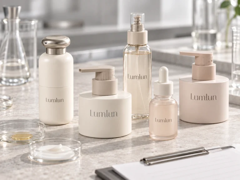
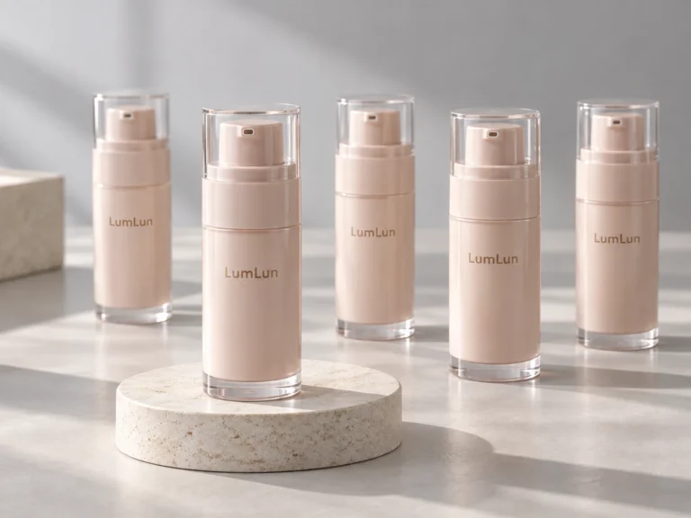
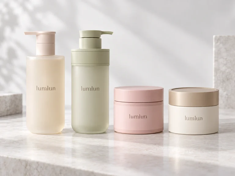
Luxury cosmetic packaging does not necessarily mean bottles with more complex structures, more printing techniques, or more expensive materials. Many skincare packages that genuinely feel premium actually look very simple at first glance: the packaging model itself has a clear visual direction, the colors are consistent, the logo is appropriately sized, and the final effect is completed with suitable printing, hot stamping, coating, frosting, or a matte finish.
For brands, normal packaging development also usually does not start by designing the bottle, pump, and cap separately from scratch and then freely combining different components. More often, the process starts by finding a complete existing packaging model from a supplier that fits the brand positioning, then customizing the color, logo, printing, and surface finish around that model. Therefore, what luxury cosmetic packaging really needs to solve is not “how many more processes can be added to the package,” but whether the existing packaging model itself matches the visual direction the brand wants, and whether the later color, logo, surface treatment, and paper box can continue around the same direction.
A Premium Look Starts with Choosing the Right Complete Packaging Model
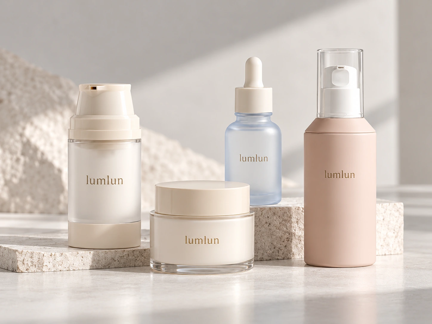
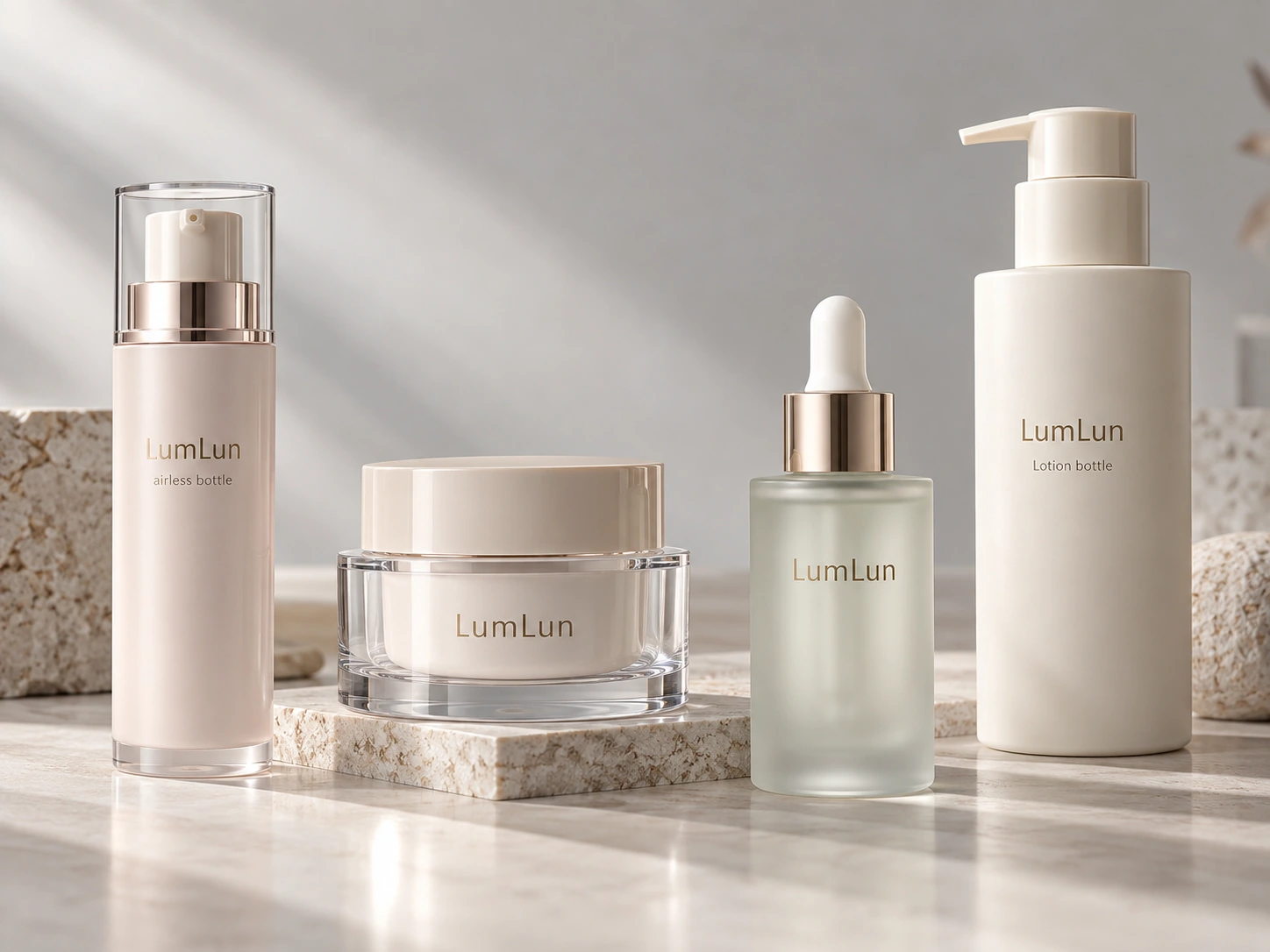
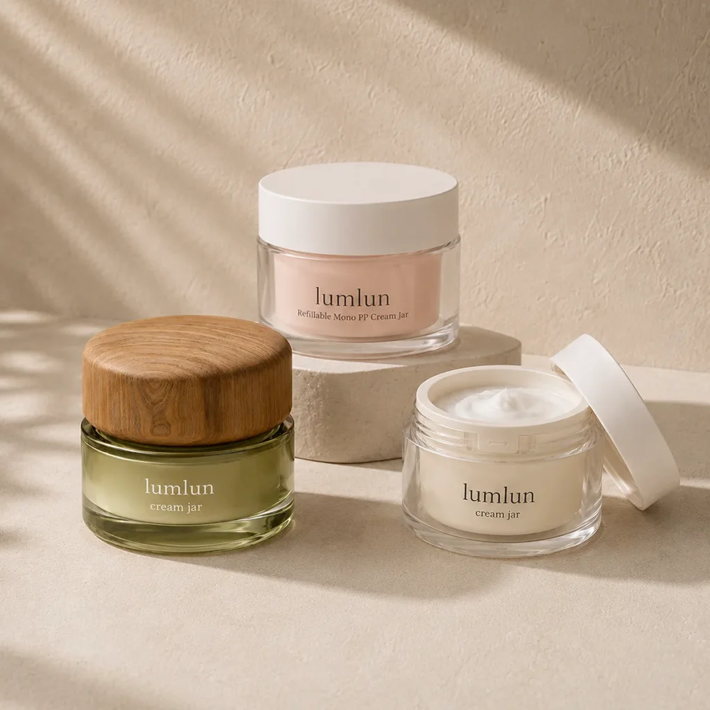
Before starting color and logo customization, the first thing that actually needs to be determined is the packaging itself. Even among 50ml cream jars, different models can present completely different visual impressions. Some are short and wide, while others are tall and slim; some have a transparent outer shell or double-wall structure that creates more visible layering, while others use a simpler, cleaner form that is better suited to a minimalist brand direction.
The same applies to airless bottles, lotion bottles, and dropper bottles. The bottle shape, shoulder, overall height, outer-shell structure, and available decoration area of different models already determine a large part of the visual effect. Therefore, if a brand wants to develop premium skincare packaging, a more reasonable sequence is not to choose an ordinary package first and then keep adding decoration to make it “look premium,” but to first find a complete packaging model whose own appearance already fits the brand positioning. If the base package already matches the desired feeling, the later color, logo, and surface finish usually only need to reinforce that direction.
Different Packaging Structures Can Create Different Premium Directions
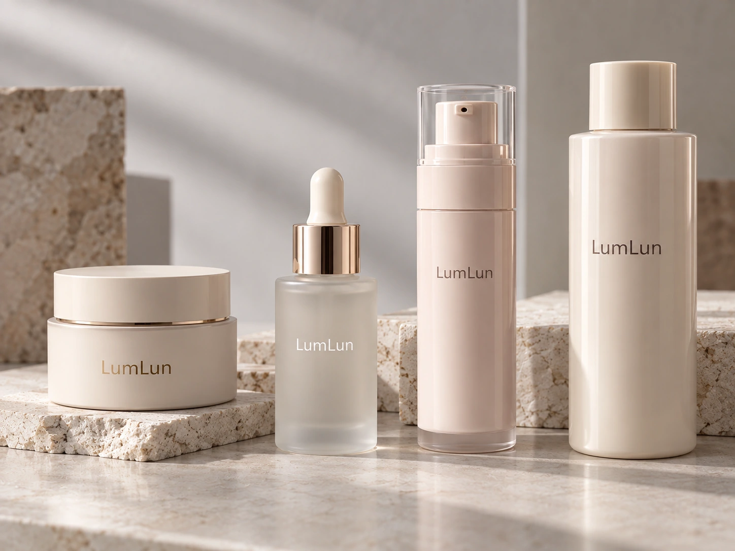
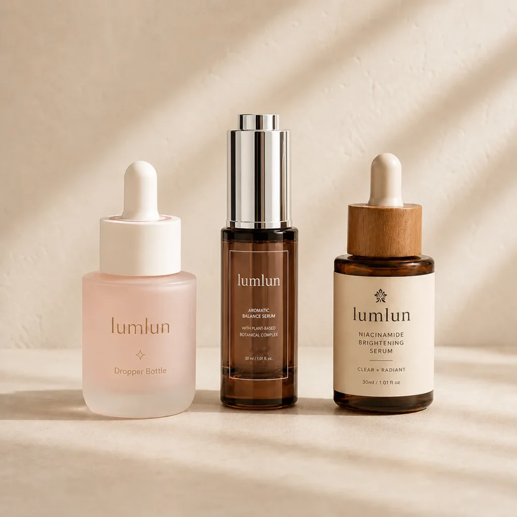
A premium look does not belong to one fixed packaging structure. A simple airless bottle can present a modern, clean visual direction; a cream jar with a transparent outer layer or double-wall structure can create more visible depth; a glass dropper bottle can convey a different product character; and a relatively simple lotion bottle can still create a complete premium appearance when the model, color, and decoration are handled well.
Therefore, when judging whether a package is suitable for a premium product, there is no need to simply ask whether it is double wall or whether it has a transparent outer shell. These are only part of the structural characteristics. A more meaningful question is: does the visual direction presented by this complete model match what the brand wants to express? Some brands need packaging that feels more substantial and refined, while others want something light, minimalist, and modern. Both directions can become premium packaging. The key is whether the packaging structure truly serves the brand positioning rather than simply pursuing complexity.
Premium Packaging Does Not Mean the Package Has to Look Thicker
Some cosmetic jars and skincare bottles use thicker outer shells, double-wall structures, or transparent outer layers to create more obvious visual weight. These products are indeed often used in skincare packaging projects that emphasize a more substantial feel. However, “thicker” does not itself mean “more premium.” Some packages may have strong visual weight but still not fit a minimalist, youthful, or lightweight brand direction; conversely, some simpler structures can still present a very clean premium effect when the model is chosen well and paired with consistent color and decoration.
Therefore, brands do not need to pursue thicker or more complex packaging simply for premium positioning. A more practical approach is to compare different real models according to the feeling the brand wants to present: some are more suitable for a stable, substantial direction; some are better for a clean, modern direction; and others can create more visible effects through transparent layering or outer-shell structures. The packaging structure should serve the brand direction rather than adding structure simply to make the package look more complex.
Color Control Often Matters More Than Adding More Decoration
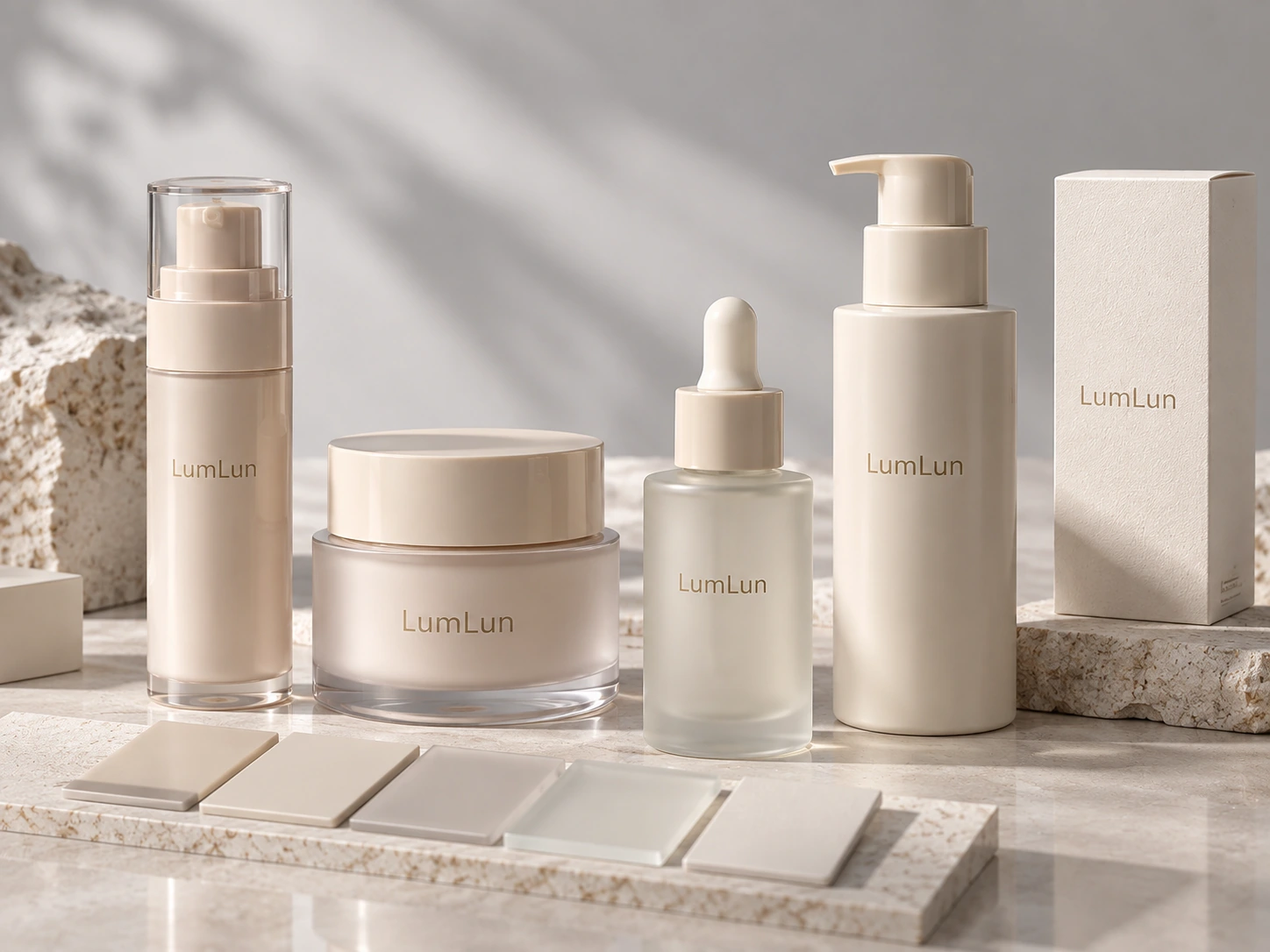
Premium skincare packaging often uses relatively simple color palettes. Black, white, ivory, beige, light gray, low-saturation pink, and various custom brand colors can all form the basis of premium cosmetic packaging. But what often affects the final result is not which color the brand chooses, but whether that color can remain sufficiently coordinated across different packages, different components, and different materials.
When the same Pantone color is applied to different plastics, transparent outer shells, coated surfaces, or paper boxes, the actual result may vary. Material base color, gloss or matte finish, and production processes can all affect the final appearance. This is especially important when a brand is developing multiple SKUs such as serum, cream, lotion, or cleanser. If all packages use the same brand color but the finished products show obvious color differences, the entire line may lose visual consistency when placed together.
Therefore, color consistency itself is part of premium packaging. Pantone can serve as an important reference for color communication, but for projects that truly require a unified visual result, the final effect still needs to be judged together with physical color samples and pre-production samples rather than relying only on colors displayed on a computer screen.
Quick Comparison: What Usually Creates a More Premium Look?
| Packaging direction | Typical premium impression | What often matters most | Usually suitable when… |
|---|---|---|---|
| Airless Bottle | Clean, modern, controlled | Model proportion, shoulder line, finish consistency, pump appearance | The brand wants a sleek premium direction with precise dispensing |
| Cream Jar | Substantial, layered, calm | Jar proportion, wall structure, logo restraint, surface texture | The product line needs a richer visual weight or a stronger cream focus |
| Dropper Bottle | Refined, focused, delicate | Glass feel, frosting level, collar match, logo scale | Serum or treatment products need a more detail-led premium feel |
| Packaging Family | Unified, recognizable, complete | Color consistency across SKUs, repeated logo logic, coordinated finishes | Different products need to look like one brand rather than isolated items |
Matte, Gloss, Frosted, and Coating Should Follow One Main Direction
Surface treatments can clearly change the visual feeling of the same package. A matte finish reduces strong reflections and gives the product a softer appearance; a gloss finish creates a clearer shine; coating can further change the color, touch, and overall visual effect. These effects are not inherently “premium” or “ordinary.” What really matters is whether they are used around the same design direction.
If a project uses very bright colors, large metallic effects, multicolor printing, hot stamping, and complex gradients at the same time, each technique may look distinctive on its own, but together they can make the package lose a clear visual focus. By contrast, a cream jar with an already clean form may only need a matte color and a simple logo; a transparent dropper bottle may only need a frosted effect and a small amount of printing to create a complete result.
Therefore, in luxury cosmetic packaging, the goal is not to use more processes, but to use the right ones. The brand should first define the main visual direction and then select the surface finish that truly strengthens that direction instead of continuously stacking processes on the package.
Compare Three Real LumLun Packaging Directions Before Fixing the Premium Look
If the visual direction is not fixed yet, comparing a few real packaging routes first is usually more useful than discussing “premium” in the abstract.
The Logo Does Not Need to Be Large; Negative Space Is Also Part of Packaging Design
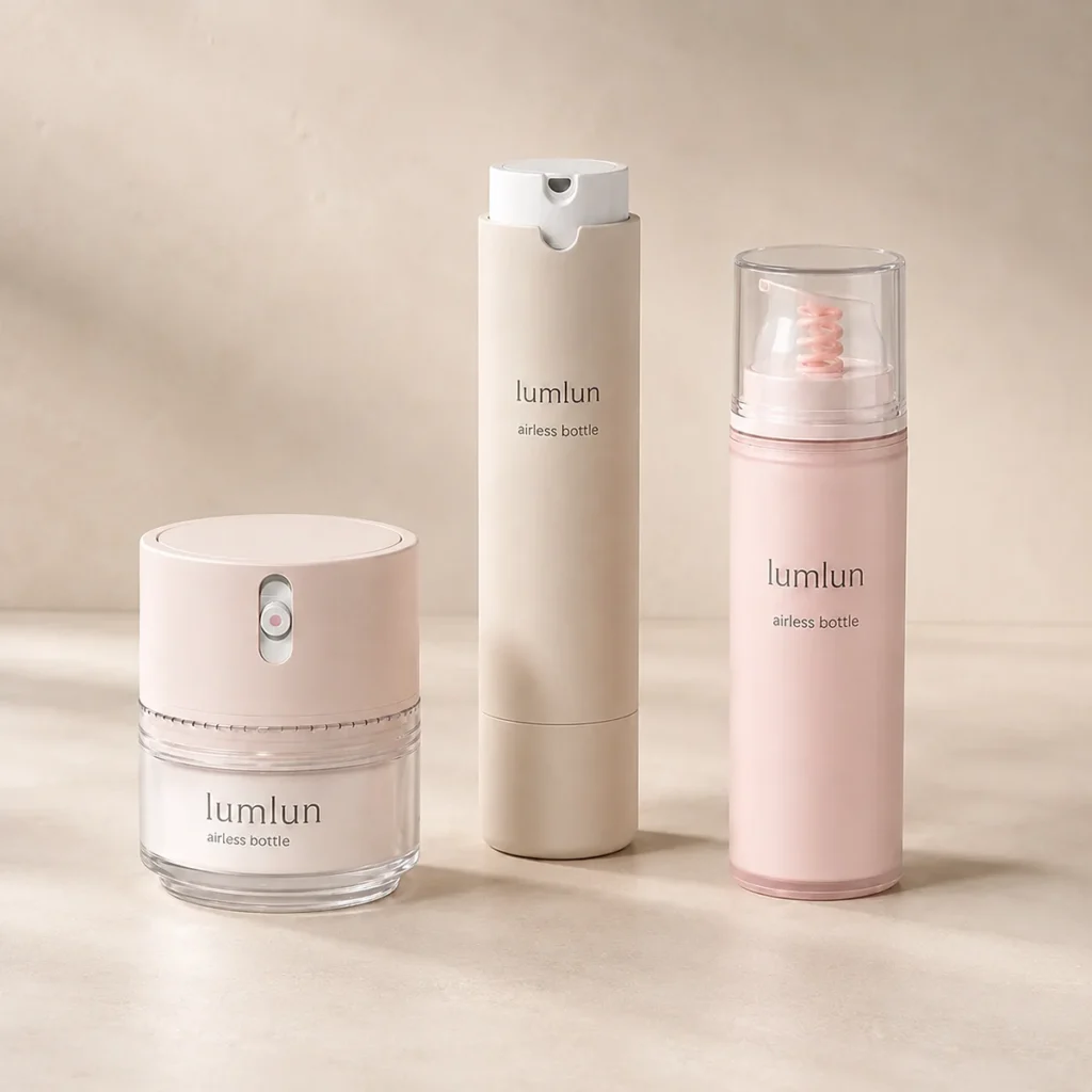
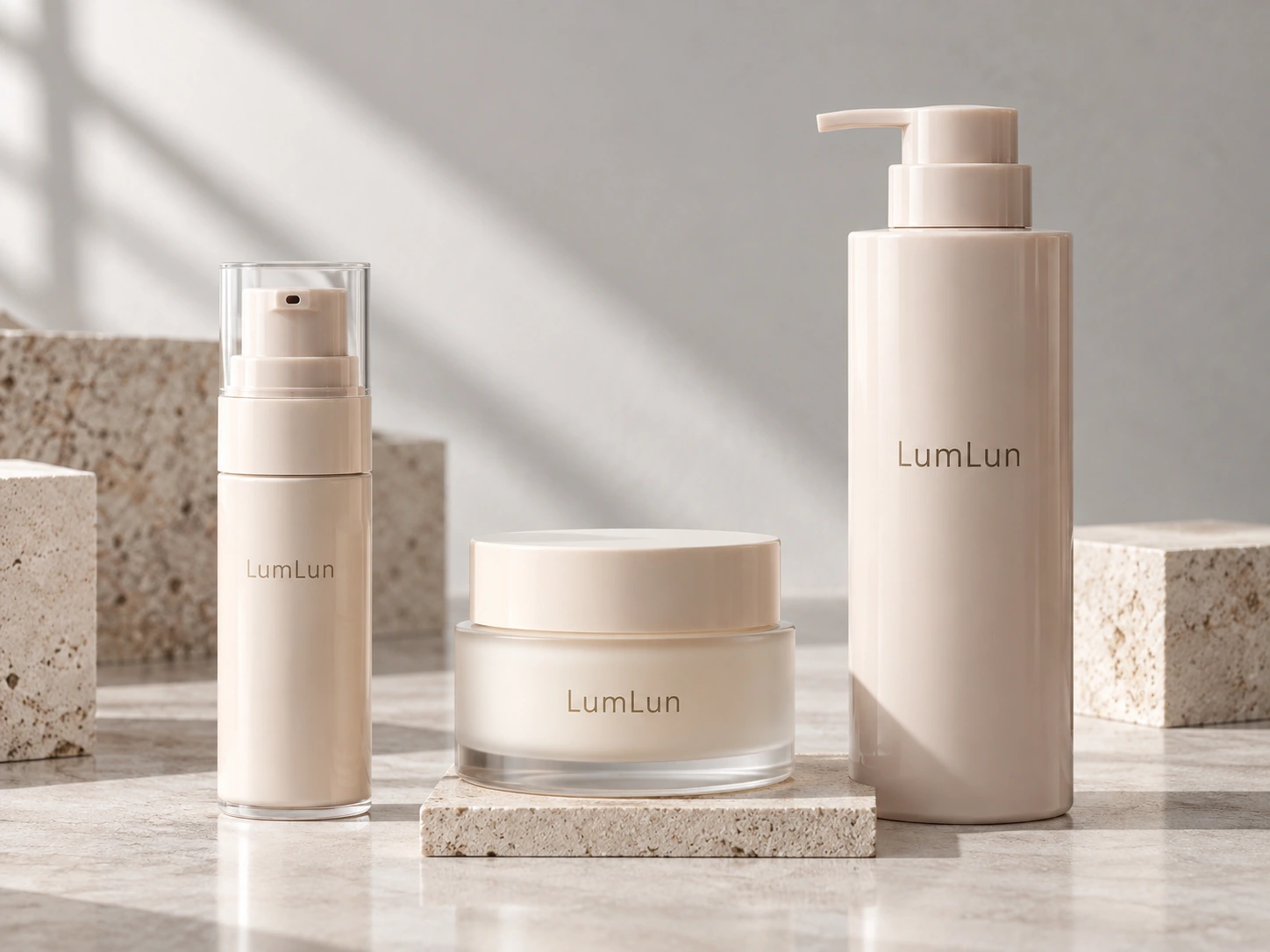
A logo is an important part of brand recognition, but on premium packaging it does not necessarily need to occupy a large area. Many clean skincare packages retain a large amount of uncluttered surface and use only a relatively restrained logo and product information, so the consumer sees the package as a whole rather than one oversized graphic or line of text.
Of course, this does not mean the smaller the logo, the better. What really needs to be considered is the proportion between the logo, the package itself, and the other information. Different bottles, jars, and tubes each have their own suitable artwork area. Cylindrical bottles, curved bottles, low-profile cream jars, and narrow tubes do not have the same printable area, so the same logo artwork cannot simply be copied at exactly the same size onto every package.
A more practical method is to adjust the logo scale and position according to the actual product dimensions. A logo may appear to be the right size on a computer artwork file, but when it is applied to a 30ml bottle and a 200ml jar, it needs to be checked separately. The goal of premium packaging is not to make the logo as prominent as possible, but to keep brand recognition in balance with the package itself.
Printing and Hot Stamping Should Strengthen the Brand, Not Cover the Package
Silk screen printing, hot stamping, and other decoration options can all be used for luxury cosmetic packaging, but the real role of these processes is to place the brand information naturally onto an already selected packaging design rather than relying on decoration itself to recreate a completely different product.
For example, a matte black cream jar can use a small amount of gold hot stamping; a frosted bottle can use simple white printing; and an airless bottle that already has a clear visual character may only need a clean logo. If the packaging model itself is already distinctive enough, the decoration can be even more minimal. On the other hand, if the brand needs a more noticeable visual effect, local metallic details, hot stamping, or more vivid printing can be used to make the product stand out.
The key is still not how many processes are used, but whether those processes serve the same direction together. Decoration should strengthen the existing design rather than using a large number of processes to hide a packaging model that does not fit the brand positioning.
A Premium Packaging Line Does Not Need Every Product to Use Exactly the Same Container
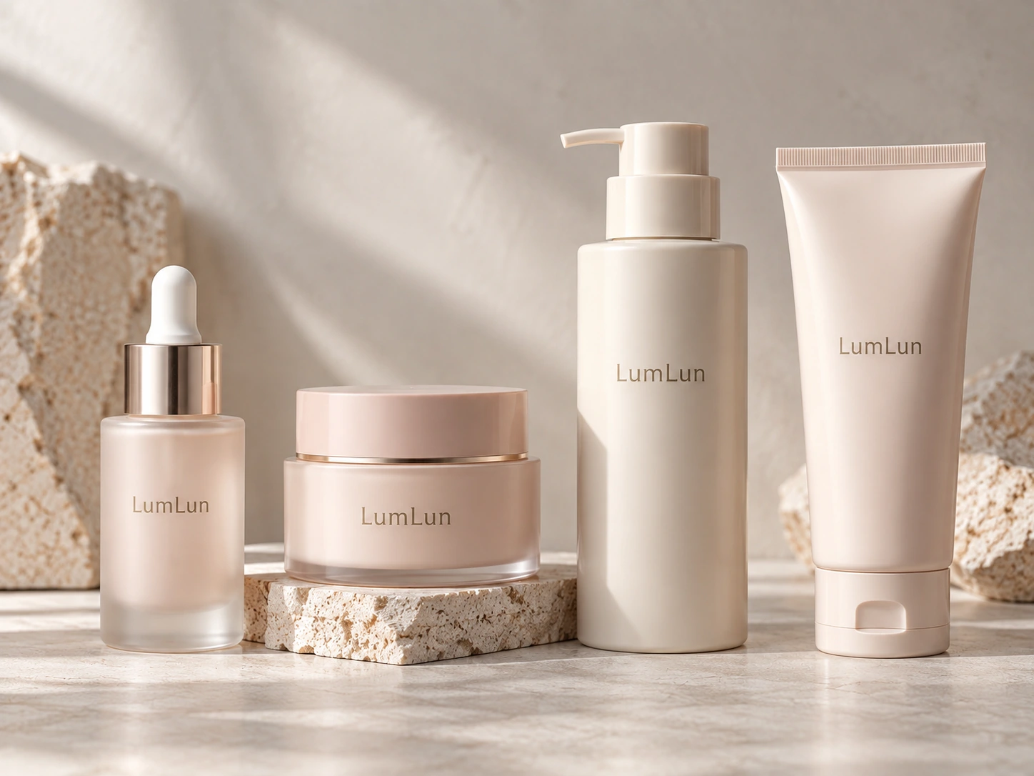
A complete skincare brand may include serum, face cream, eye cream, lotion, and cleanser. Because different formulas have different textures and dispensing methods, they are not necessarily suitable for the same packaging structure. Serum may use a dropper bottle or airless bottle, face cream may use a cream jar, lotion may use a lotion pump bottle, while cleanser may use a cosmetic tube, pump bottle, or another structure that fits the actual formula.
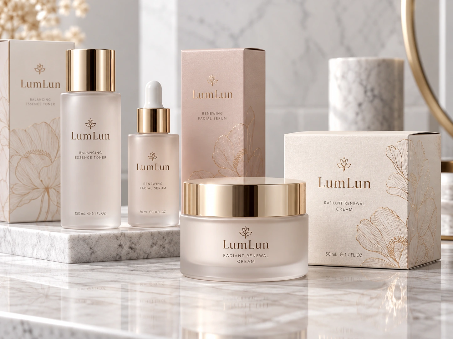
Therefore, to create a unified luxury skincare packaging line, there is no need to force every product into containers with exactly the same appearance. A more reasonable method is to select existing packaging models whose visual directions can work together, then build connections across different packages through the same or similar color direction, logo style, printing position, and surface finish. In this way, even when the structures differ, consumers can still naturally understand that the products belong to the same brand line when they are placed together.
Consistency across a packaging family does not mean every packaging structure must be the same. What really matters is allowing different products to share the same brand language through color, logo, decoration, and the overall visual direction.
The Paper Box Should Continue the Direction Already Established by the Primary Packaging
For products that include a cosmetic paper box, the box is often the first part consumers see, so the secondary packaging should also stay consistent with the visual direction of the bottle, jar, or tube. If the primary packaging already uses a very simple, low-saturation design but the paper box suddenly uses many high-saturation colors, complex graphics, and very dense decoration, the two packages can create an obvious visual break when placed together.
The paper box does not need to look exactly the same as the inner package, but it can continue the core elements that have already been established, such as the main brand color, logo scale, typography direction, or one main decoration technique. If the bottle uses local gold hot stamping, the paper box can also continue a suitable amount of gold detail; if the primary packaging uses a very clean matte direction, the outer box can remain relatively restrained as well.
This allows customers to see a complete brand system from the paper box to the actual product rather than two separate designs. For luxury cosmetic packaging, the primary packaging and paper box are best developed from the same brand direction.
A Reference Image Can Help Define the Direction, but It Cannot Replace a Real Sample
Many customers begin a packaging project by providing a brand package they like, a reference image, or a design rendering. These materials are very useful because they help the supplier understand the shape, color, finish, and overall visual direction the brand wants more quickly, and they can also serve as an important reference when searching for the same or a similar existing packaging model.
However, a reference image is not the same as the final physical product. Colors on a screen, material reflections, transparency, and metallic effects may all differ from real packaging. Even if a real model that looks very similar is found, the color, logo, and surface processes still need to be confirmed on the actual product. Therefore, a more reasonable process is usually to first find the same or a similar real packaging model based on the reference image, then confirm the color, logo, and decoration direction, and finally check the result through a pre-production sample.
This step is especially important for luxury packaging because much of what is described as a “premium feel” comes from very subtle differences, such as color saturation, the degree of matte effect, the brightness of hot stamping, and the actual logo size. These details are difficult to judge completely from a computer rendering alone.
A Pre-Production Sample Is an Important Stage for Confirming the Premium Appearance
After the packaging model, color, logo, and surface processes have been confirmed, a pre-production sample allows the brand to see the actual finished product before mass production. At this stage, the real checks are not limited to whether the logo has been printed correctly. They also include whether the actual color is close to the approved standard, whether the matte, gloss, frosted, or coating effect meets expectations, whether the position and size of printing and hot stamping are appropriate, and whether the paper box and primary packaging look coordinated when placed together.
If the project includes multiple SKUs, samples of the different products can also be placed together to check whether the color, logo, and processes form a consistent brand language. This makes it easier to notice obvious inconsistencies across the line than when each product is reviewed separately.
Therefore, the premium appearance should ultimately be judged through real packaging rather than relying only on renderings or screen displays. Renderings can help define the direction, but before mass production begins, the brand still needs to see the final combination of real materials, real colors, and real decoration.
True Premium Packaging Makes Every Choice Belong to the Same Direction
There is no single fixed template for luxury cosmetic packaging. Transparent packaging can look premium, and solid-color packaging can also look premium; a double-wall jar can create obvious visual depth, while a simple PP cream jar can also present a very clean effect; hot stamping can become a visual focal point, while premium packaging can also be created without metallic effects.
What really affects the result is whether the entire packaging project has a clear and consistent direction. A more reasonable development sequence is usually to first select a suitable complete existing packaging model according to the product and brand positioning, then determine the color direction, arrange the logo, printing, and surface finish, and, if a paper box is needed, let the outer box continue the brand visual that has already been established. For projects with multiple SKUs, there is also no need to force the use of exactly the same packaging; instead, different models can form a unified packaging family through color, logo, and processes.
A premium look is not defined by how many processes are used on the package, but by whether the packaging model, color, logo, surface finish, and paper box all express the same brand direction. When these elements are sufficiently consistent, even very simple packaging can present a complete, clear, and recognizable premium appearance.