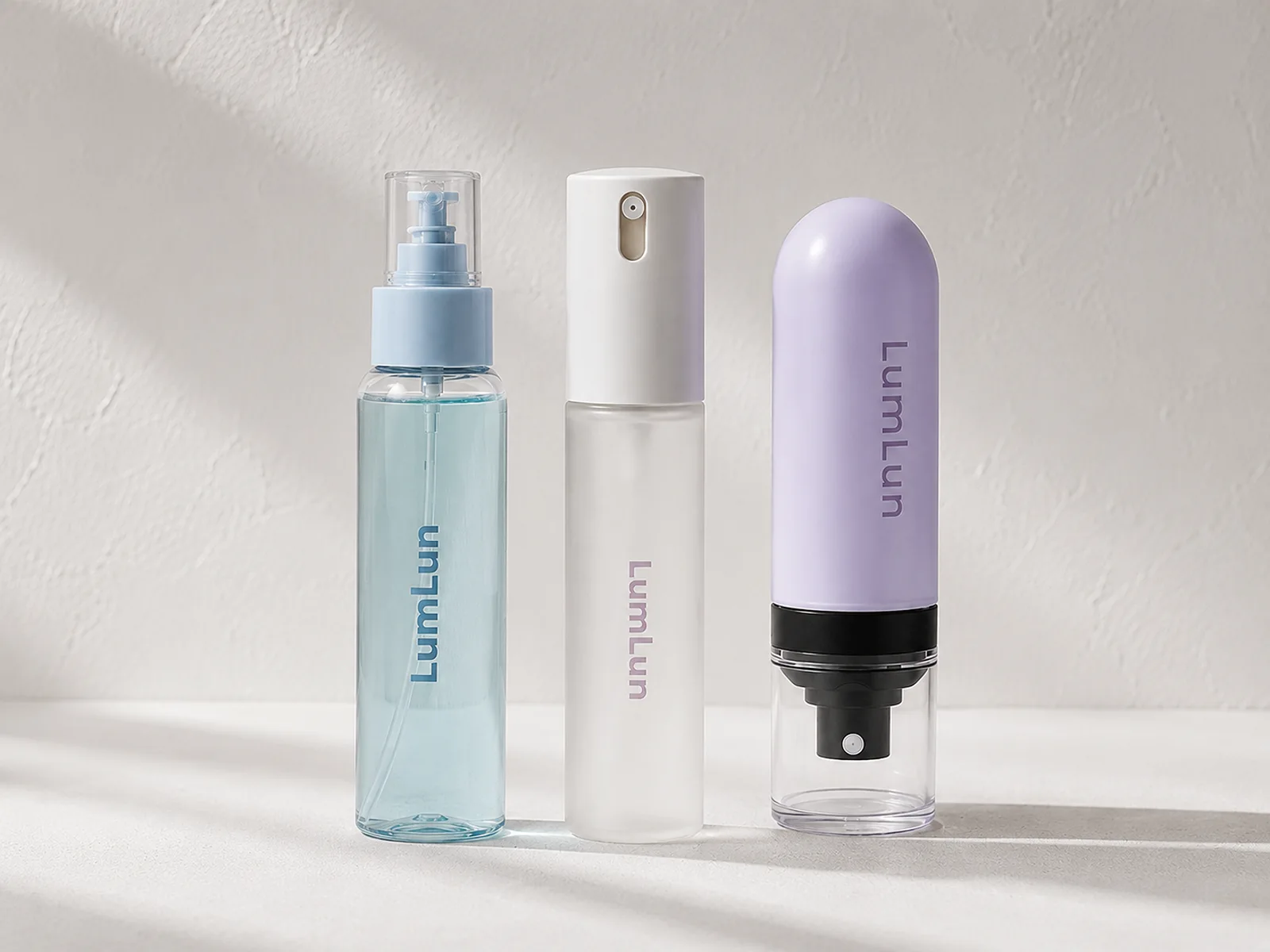
Facial mist packaging needs to make the spray experience believable before the customer presses the pump. Bottle shape, transparency, cap, spray head and color all contribute to whether the product feels refreshing, portable, treatment-led or suitable for frequent daily use.
The strongest design is not simply the most decorative bottle. It is the one that makes the product easy to recognize in a product image, comfortable to use and consistent with the rest of the skincare range while leaving enough flexibility for different capacities and future SKUs.
Browse the current LumLun fine mist spray bottle collection. When the intended experience involves a longer spray action, the separate guide to continuous mist packaging for skincare covers that decision without confusing the two spray formats.
Reviewed by the LumLun Packaging project team · Updated July 2026
Key Takeaways
- Define the spray experience before the decoration. The pump and bottle need to support the way the mist will be used.
- Use bottle shape to build recognition. A distinctive but practical outline can help the product stand out online and on shelf.
- Choose transparency for a reason. Clear, frosted and colored packs communicate different skincare positions.
- Coordinate the pump, cap and bottle. These components should look like one product rather than unrelated parts.
- Plan capacities as a connected range. Portable, everyday and larger formats need consistent branding but adapted proportions.
Decision Table
Facial mist packaging: fast design comparison
| Decision | Compact direction | Core daily direction | Larger-use direction |
|---|---|---|---|
| Capacity role | Travel, handbag, trial or gift-set companion | Main facial mist SKU for routine use | Home, spa, body-and-face or high-frequency use |
| Visual priority | Portability and a clear front panel despite the small area | Balanced overall shape, readable artwork and comfortable grip | Stability, pump scale and a reason for the larger format |
| Typical finish direction | Clear, frosted or a strong color cue for quick recognition | A coordinated transparent, frosted or matte brand finish | Simple, confident decoration that does not make the bottle feel cluttered |
| What to confirm | Cap retention, overall height and artwork space | Spray experience, bottle proportion and brand consistency | Spray angle, bottle handling, transport and product role |
What Makes Packaging Fit a Facial Mist Product?
A facial mist bottle fits when the spray action, bottle size and visual design support the same customer routine.
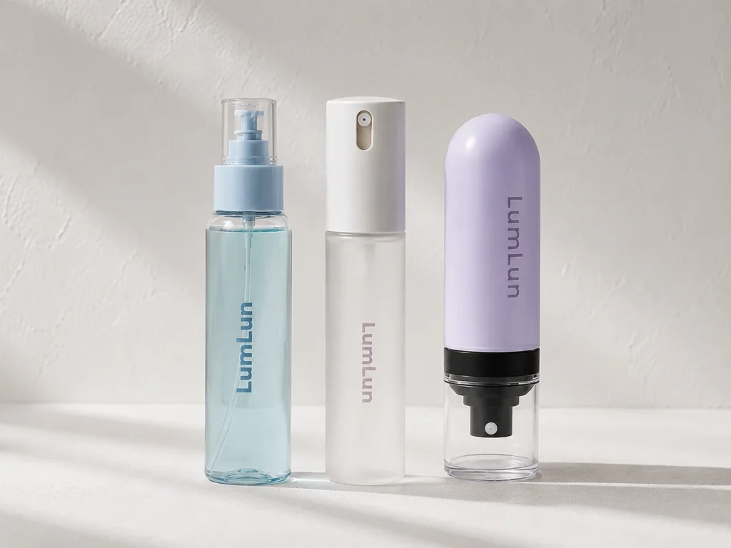
The package should immediately communicate a skincare product, feel comfortable to hold and provide enough front-panel space for the brand and required artwork. A compact cylinder can look precise and portable. A wider or rounded bottle can feel softer and more lifestyle-led. A capsule or protected-pump format can make portability part of the design.
The spray mechanism still matters, but it should not dominate the article or the brand story. The practical question is whether the selected pump and formula create the intended mist under real filling and use conditions. Once that direction is realistic, the brand can concentrate on capacity, overall shape, color and line architecture.
Do not choose a bottle only because it looks attractive in an empty sample. Review the assembled bottle, filled appearance, cap, spray head and artwork as one product.
Start With the Spray Experience the Product Should Deliver
Decide whether the product promise is a light refreshing mist, a more generous skincare application or a broader continuous-spray experience.
A standard fine mist format commonly supports short, deliberate sprays and compact skincare packaging. A continuous mist format can support a longer spray action and broader coverage when that experience genuinely belongs to the product. Neither should be described as universally better; the intended use, formula direction and actual mechanism decide the fit.
The customer should understand the action without effort. A protective cap, exposed pump, top-press design or ergonomic trigger creates a different expectation before the first spray. The packaging copy and product photography should show the action accurately rather than promising an effect the selected package has not demonstrated.
When a project is specifically deciding between the two spray actions, use the guide to continuous mist packaging for skincare; this article keeps the focus on the final facial-mist package.
Which Capacity Fits Portability and Daily Use?
Capacity should match where the customer keeps the product and how often it is expected to be sprayed.
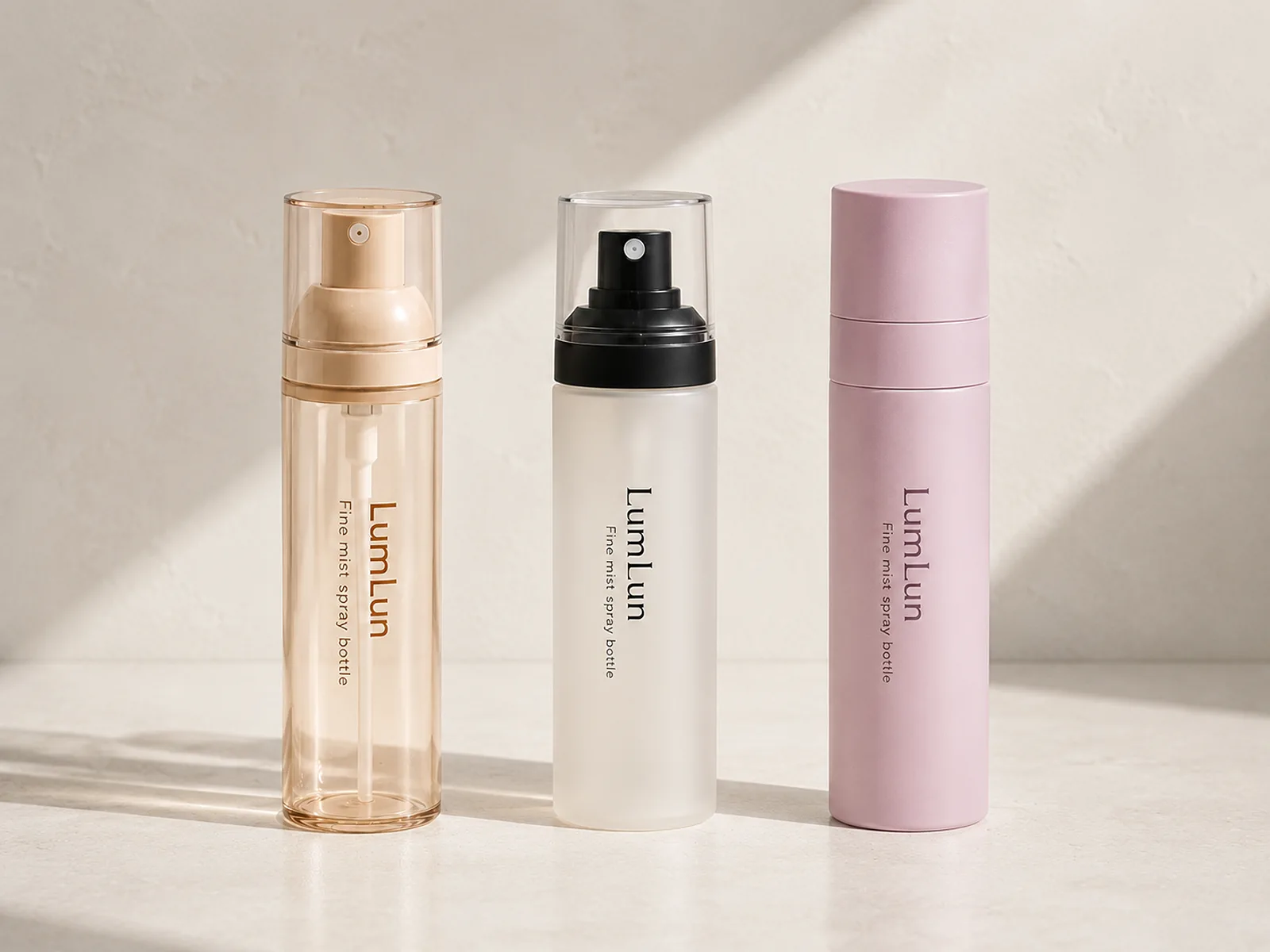
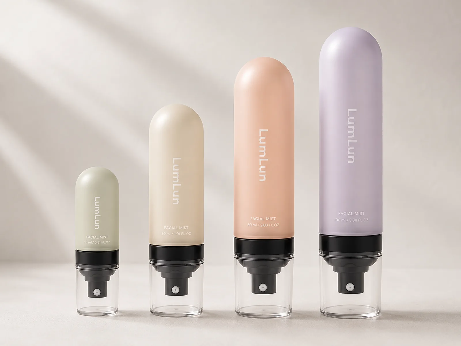
A 15ml or 30ml direction can work for travel, gift sets, discovery sizes and handbag reapplication, provided the bottle remains easy to hold and the artwork is still readable. A 50ml or 60ml format can balance portability with a more substantial retail presence. A 100ml direction can work as a core home-use SKU or a more generous daily mist.
These are product roles, not universal rules. Formula usage, spray output, market expectations and the brand’s price architecture all influence the final size. Avoid publishing a precise number of uses unless it has been measured with the real pump and filled formula.
When several sizes are planned, each needs a clear reason. A travel bottle that looks identical to the main bottle can build recognition, while a larger size should not feel like an unrelated body-spray product unless that is the intended extension.
How Bottle Shape Changes the First Impression
Bottle shape tells the customer whether the mist feels clinical, soft, playful, portable or premium before any claim is read.
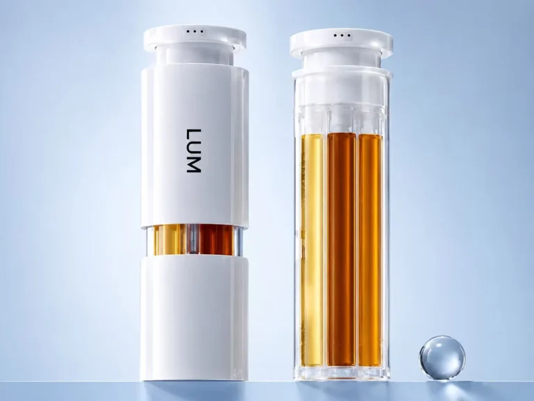
Tall cylinders create a clean vertical canvas and can make a compact capacity look elegant. Rounded shoulders can soften the overall shape and fit a gentle hydration story. Square or thick-wall forms can create more visual weight. Capsule and protected-pump structures can make portability and product interaction more distinctive.
The proportion of pump to bottle matters as much as the body shape. A large cap on a very small bottle can make the package feel top-heavy. A narrow spray head on a large bottle can feel underscaled. Check the product from the same angles used in e-commerce images and on the planned shelf.
Use shape to support recognition, not novelty alone. A distinctive overall shape is valuable only when it remains comfortable, stable and practical for filling, packing and daily use.
Send the facial mist bottle you like or one reference image. We can help compare bottle shapes, spray components and finish options without requiring a finished specification.
Clear, Frosted or Colored: How Should the Formula Be Presented?
Use transparency to decide how much of the formula, liquid level and inner structure should become part of the visual identity.
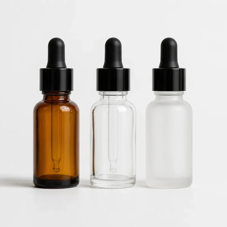
A clear bottle can make a clean, lightly tinted formula visible and create a fresh impression. It can also show the dip tube and remaining product, which some brands welcome and others prefer to soften. A frosted finish reduces visual noise and gives a gentle skincare surface while retaining some translucency.
An opaque or color-coated bottle gives the strongest control over the brand palette and can make multiple formulas look consistent. Gradient, soft-touch, matte or glossy effects can add depth, but decoration should not obscure the practical spray head or make the pack difficult to read.
Material and coating capabilities are model-specific. Select the real bottle first, then confirm which transparency, color and finish effects can be produced consistently on that surface.
How Should the Pump, Cap and Bottle Look Together?
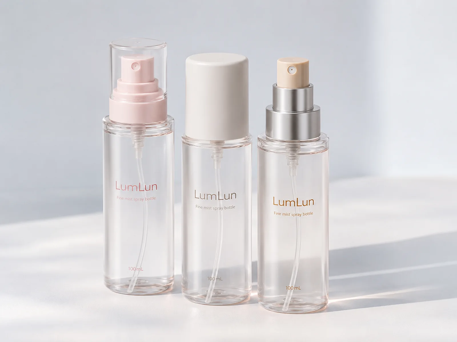
The spray head and cap form the top third of the product, so they must be designed with the bottle rather than added after it.
A clear cap can keep the pump visible and make the mechanism part of the presentation. A color-matched cap can create a quieter, more unified overall shape. A metallic-effect collar can add a precise accent when it connects to the logo, secondary packaging or other products in the range.
Cap retention, pump height and spray-button shape also influence use. The customer should be able to remove and replace the cap without confusion, and the spray opening should be easy to identify. For portable formats, the closure should not feel loose or visually improvised.
Review color tolerances across the bottle, pump and cap. Components made from different materials may not display an identical color or sheen, so the design should either accept a controlled tonal difference or use contrast deliberately.
How Can Color, Finish and Logo Strengthen the Brand Story?
A strong facial mist design uses decoration to clarify the product promise and make the bottle recognizable at thumbnail size.
Soft blue, lavender, cream and translucent tones can support hydration and calm without becoming generic when the overall shape and typography are distinctive. Brighter or more saturated colors can support an energetic or sensorial direction. The right choice depends on the complete range, not on a trend color alone.
Logo placement should remain readable when the bottle is photographed, held and placed in a gift set. On a small bottle, one clear hierarchy often works better than multiple lines of decorative copy. On larger formats, the added front-panel space can support a product name and essential information without crowding.
Use the LumLun customization and sustainability page to compare spray color, matte and glossy finishes, silk-screen printing, hot stamping, gradient and other available directions after the bottle has been shortlisted.
How Will the Bottle Perform Online, on Shelf and in a Gift Set?
The same bottle must remain recognizable in a small product thumbnail, stable on a shelf and proportionate inside secondary packaging.
For e-commerce, the overall shape and cap should remain clear against a light background, and the label hierarchy should still work when the image is reduced. Transparency needs controlled lighting so the bottle does not disappear. A distinctive color block or pump shape can improve recognition without adding unnecessary text.
On shelf, height and width affect how the bottle sits beside serums, toners and creams. In a gift set, the cap and pump add more height than the nominal bottle body suggests, so the complete assembled dimensions must be used for the insert and box.
Packaging can improve the opportunity to be noticed, understood and remembered, but it cannot guarantee clicks, sales or repeat purchase. Its role is to remove visual friction and make the product promise easier to recognize.
How to Build a Recognizable Facial Mist Range
Keep the core bottle language consistent and use capacity, color or artwork to explain the role of each SKU.
A travel mist, core facial mist and larger home-use mist can share the same cap tone, logo position and bottle family. Different formula variants can use controlled color shifts while keeping typography and finish consistent. This creates recognition without making the products difficult to distinguish.
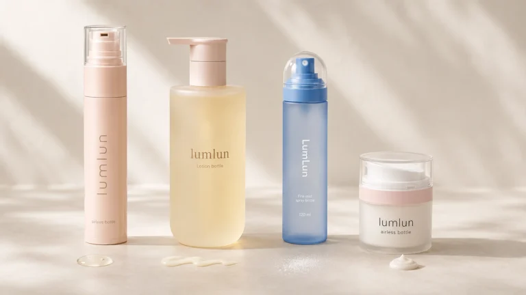
A broader skincare line can connect facial mist to toner, serum and moisturizer through a shared palette or component detail. The bottles do not need identical structures. A fine mist bottle can sit beside an airless serum bottle when the brand language is consistent and each product still uses the mechanism that fits its routine.
Plan the range before final artwork. It is easier to reserve a stable logo position, color system and secondary-packaging hierarchy at the start than to rebuild the design after a second or third SKU is added.
How to Choose or Customize a Facial Mist Bottle
Shortlist the bottle by spray direction, capacity, overall shape and component design, then customize the appearance on a real model.
Begin with the intended use: travel refresh, daily facial mist, treatment step, body-and-face product or broader continuous coverage. Add the preferred capacity and one or two visual references. LumLun can then compare real models instead of asking for a finished technical specification before the first conversation.
Once a model is close, confirm the practical customization options: bottle color or transparency, pump and cap colors, printing, finish and secondary packaging. If the reference depends on a proprietary shape or mechanism that no existing model can approach, custom tooling can be evaluated separately.
The final choice should make the product easy to recognize, natural to spray and consistent with the rest of the brand. That is a more useful standard than selecting the most decorative bottle in isolation.
Decision Table
Which facial mist design direction fits the brand?
| Brand objective | Stronger starting direction | Why it may fit | What to avoid |
|---|---|---|---|
| Fresh and formula-visible | Clear or lightly tinted bottle with a clean pump and cap | Lets the formula color and liquid level become part of the visual story | Assuming visibility alone makes the pack premium |
| Soft and skincare-led | Frosted or translucent body in a restrained palette | Creates a gentler surface and can reduce visual clutter | Using too many finish zones on a small bottle |
| Bold and recognizable | Opaque or color-coated bottle with a distinctive overall shape | Builds strong shelf and thumbnail recognition | Letting the color hide an unbalanced pump or cap |
| Multi-SKU range | One bottle family with controlled capacity, color or artwork changes | Keeps recognition while making each SKU easy to distinguish | Changing shape, pump and logo placement on every size |
Final Recommendation
Choose the facial mist package by the spray experience, daily-use capacity and complete overall shape. Use clear or lightly tinted packaging when formula visibility strengthens the story; use frosted or opaque finishes when the brand needs a softer or more controlled visual system. Keep the pump, cap, logo and bottle proportion consistent so the product remains recognizable online, on shelf and within the wider skincare range.
Frequently Asked Questions
What size is suitable for a facial mist bottle?
Small sizes suit travel and trial, medium sizes often work as the core retail format, and larger sizes fit frequent home use. The full height including pump and cap should be reviewed.
Should a facial mist bottle be clear or frosted?
Clear works when formula visibility supports the story. Frosted finishes create a softer, more refined skincare appearance and can reduce visual distraction from the inner tube.
Which bottle shape looks premium for facial mist?
Premium appearance can come from thick walls, balanced proportions, a distinctive shoulder, precise pump details and a controlled finish. No single shape is always premium.
Can the bottle, pump and cap use matching colors?
Yes, subject to the selected components and production process. Coordinated colors can create a cleaner product block and stronger range consistency.
Can facial mist packaging use gradient or matte finishes?
Yes, when the selected bottle material and geometry support the process. Samples should confirm color, surface and logo contrast.
FACIAL MIST OPTIONS
Compare Facial Mist Bottle Options
Browse LumLun mist bottles or send the product you like. The first conversation can begin with the look, size or spray experience you want.