Key Takeaways
- Wanting your serum to look good in clear glass and wanting to protect it with amber glass are not contradictory instincts — they’re both correct, which is exactly why this decision feels harder than it should.
- Light-sensitive actives can lose up to 40% of their potency within eight weeks of opening, and UV exposure accelerates this breakdown by roughly 70 times compared to dark storage.
- Frosted glass is a genuine middle ground — it provides partial light protection, hides fingerprints and smudges from daily use, and reads as premium rather than clinical.
- Frosted amber (a tinted, matte finish) combines meaningful UV protection with a refined look — this combination already exists as a bestselling format, even though most guides present amber and frosted as separate choices.
- A simple formula self-test — checking for vitamin C, retinol, or unstable botanical extracts — tells you which end of the spectrum to start from.
Last Updated: June 2026
Here’s a moment many skincare brands recognize: the serum formula is finished, the brand visuals are coming together, and now it’s time to choose a glass dropper bottle. Clear glass would let that golden serum color show through beautifully on the website and in photos. But the formula contains vitamin C, and everything says active ingredients need amber glass for protection. Both of these instincts feel right — and that’s exactly the problem. This isn’t a case of one instinct being wrong. It’s that amber and clear were never the only two options for a glass dropper bottle, and the real decision is more nuanced than most guides make it sound.
Why This Feels Like Choosing Between Two Things You Both Want
The pull toward clear glass and the pull toward amber glass are both responding to something real — they’re just responding to different parts of the same product.
The instinct toward clear glass comes from how the product will be sold. For brands selling primarily through their own website and social media, the bottle is part of the photography. A beautifully colored serum visible through clear glass photographs well, looks honest, and lets the formula itself do some of the selling. This instinct isn’t about vanity — it’s about how the product will actually be presented to the people deciding whether to buy it.
The instinct toward amber glass comes from formula chemistry. If the serum contains light-sensitive actives, amber glass is the traditional answer because it blocks the wavelengths that cause those actives to break down. This instinct is about protecting the thing the brand spent the most time and money developing.
Both concerns are legitimate. Neither one should simply override the other — and the good news is that the choice isn’t as binary as “pick protection or pick presentation.” There’s more room in between than most packaging guides suggest, and the rest of this guide walks through exactly what that room looks like.
What’s Actually at Stake If the Formula Loses
A glass dropper bottle with the wrong level of light protection can cause a light-sensitive formula to visibly change within weeks — not months — which is the real cost of getting this decision wrong.
Most liquid serums lose up to 40% of their active concentration within eight weeks of being opened. For formulas built around vitamin C, retinol, or certain botanical extracts, this isn’t a slow fade over a year — it’s a measurable change within the timeframe a consumer is actively using the product. Independent stability testing has found that UV light exposure accelerates the breakdown of ascorbic acid by roughly 70 times compared to storage in darkness.
What this means in practice: a vitamin C serum in a clear bottle, kept on a bright bathroom shelf, can visibly change — shifting from clear or pale yellow toward a deeper yellow or orange — within weeks rather than months. The formula isn’t necessarily unsafe at that point, but it’s no longer delivering what the label promised, and the consumer can see that something changed. For a first-time buyer deciding whether to repurchase, that visible shift works against the brand, even if the original formula was excellent.
This is the real weight on the “protection” side of the decision — not a vague risk, but a specific, visible timeline that plays out in the consumer’s hands.
Clear, Frosted, and Amber Aren’t All-or-Nothing
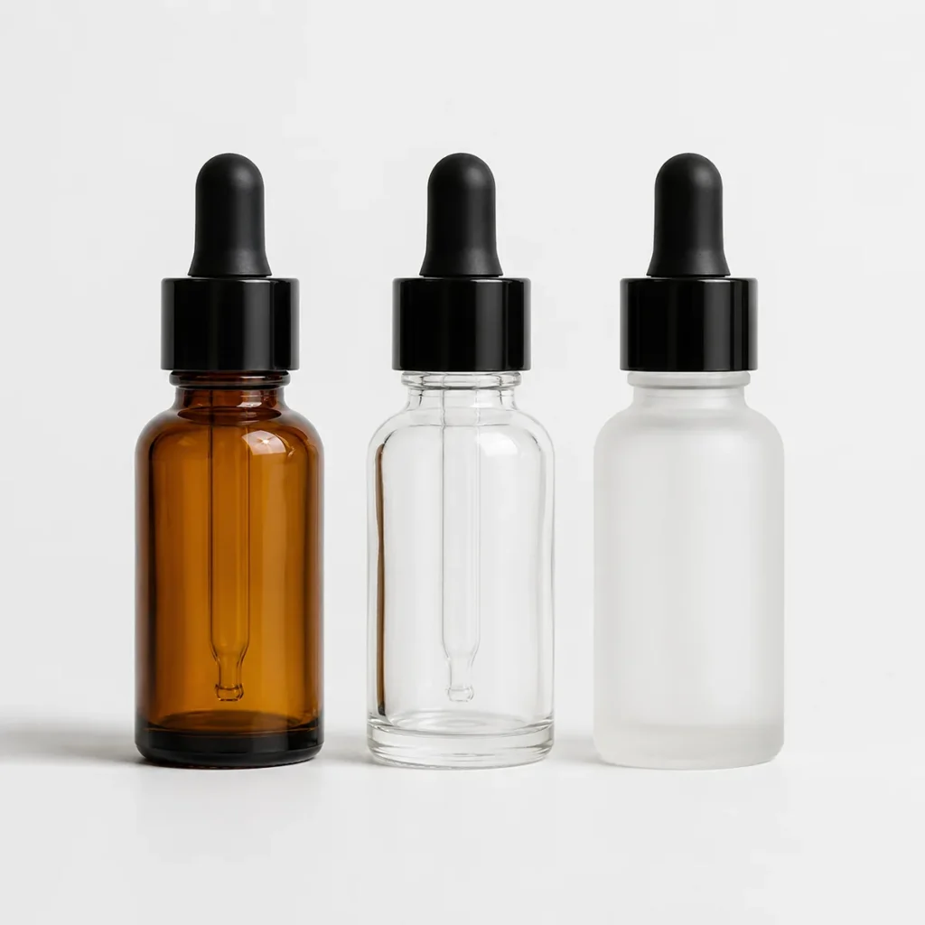
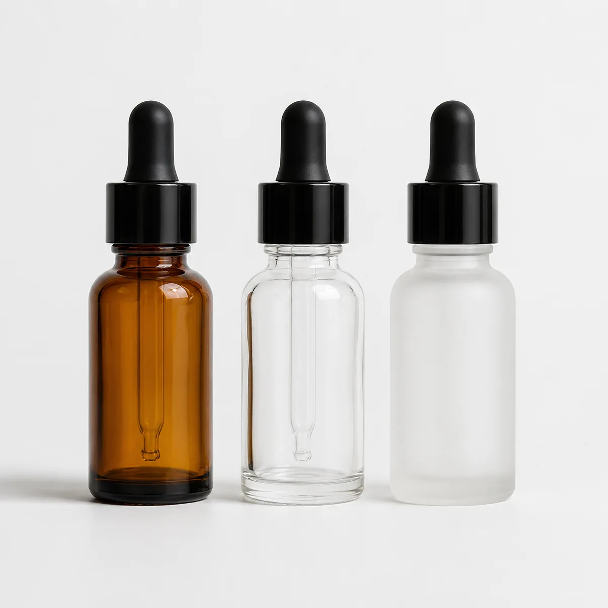
A glass dropper bottle isn’t limited to a binary choice between amber and clear — frosted finishes sit in between, and they solve more than one problem at once.
Clear glass offers essentially no protection from light. It’s the right choice when the formula is genuinely light-stable, or when showing the product’s color and texture is central to how the brand sells it.
Amber glass blocks the most UV light and is the traditional choice for vitamin C, retinol, and other actives that degrade quickly. The trade-off some brands worry about is appearance — amber can read as more clinical or apothecary-style, which may or may not match the brand’s visual direction.
Frosted glass sits in between, and it does more than soften the look. A frosted finish is created through acid etching or sandblasting of the glass surface, which diffuses the UV and visible light reaching the formula. On its own, frosted clear glass isn’t a substitute for amber when a formula is highly light-sensitive — but for formulas with moderate sensitivity, it meaningfully slows the degradation that would happen unchecked in plain clear glass.
Frosted also solves a smaller, everyday problem that rarely comes up in packaging discussions: fingerprints and smudges. Serums and facial oils leave fingerprints on glossy glass — and in a bathroom, where bottles sit on damp counters and get picked up with product still on the hands, those marks build up quickly. A frosted surface hides this almost entirely, which means the bottle looks clean and considered days after it’s been unboxed, not just in the first photo.
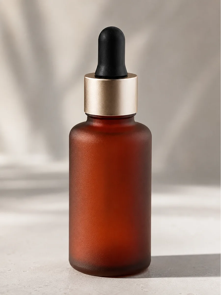
The combination that resolves this decision for many brands is frosted amber — a tinted, matte-finish bottle that pairs amber’s light-blocking properties with the refined, fingerprint-resistant surface of a frosted finish. This isn’t a hypothetical workaround: reddish-brown frosted serum bottles are already an established, bestselling format precisely because they deliver meaningful UV protection without looking like a traditional apothecary bottle. For a brand torn between “I need amber-level protection” and “I don’t want my packaging to look clinical,” frosted amber is often the answer that satisfies both.
A Simple Way to Know What Your Formula Needs
The right glass dropper bottle for a given formula can usually be determined by checking for one thing — light-sensitive active ingredients — before looking at any bottle at all.
Formulas that benefit most from strong light protection typically contain one or more of the following: vitamin C (especially L-ascorbic acid), retinol or other retinoids, certain botanical extracts and antioxidants (green tea, resveratrol, and similar compounds are commonly light-sensitive), or essential oils used at meaningful concentrations.
If the formula contains any of these as a primary active, amber or frosted amber is the safer starting point — the cost of guessing wrong is a formula that visibly changes in the consumer’s hands within weeks. If the formula is built around hydrators, peptides in stable delivery systems, or ingredients not known for light sensitivity, clear or frosted clear becomes a realistic option, and the decision can lean more toward how the brand wants the product to look and feel.
When in doubt, frosted amber is the lower-risk choice: it provides protection for formulas that turn out to be more light-sensitive than expected, while still offering a refined look rather than a purely functional one.
Not sure how your formula will behave in different glass options? Send us your formula details or a reference bottle you like, and we’ll help you narrow it down before you commit to a production run.
Matching the Bottle to Your Formula and Brand Direction
Choosing between a glass dropper bottle in amber, clear, or frosted comes down to two questions — how light-sensitive is the formula, and how the product will be presented — answered together in the table below.
| Your Situation | Recommended Option | Why |
|---|---|---|
| Vitamin C, retinol, or high-concentration actives | Amber or Frosted Amber | Maximum protection against the fastest-degrading ingredients; frosted amber adds a refined finish without giving up protection |
| Stable formula, want to showcase serum color | Clear or Frosted Clear | No light-sensitivity concern; clear shows the formula directly, frosted softens the look while still allowing some visibility |
| Unsure how light-sensitive the formula is | Frosted Amber | Lower-risk default — protects against unexpected sensitivity while avoiding a purely clinical look |
| Oil-based serum, daily bathroom use | Frosted (Amber or Clear) | Hides fingerprints and smudges from oily product residue, keeping the bottle looking clean between uses |
One Thing Worth Knowing Before You Decide
Frosted glass provides real but partial protection — it’s worth being clear-eyed about what it does and doesn’t do.
A frosted finish diffuses light and reduces UV exposure compared to plain clear glass, but it does not block light to the degree that amber glass does. For formulas with mild to moderate light sensitivity, frosted clear can be enough on its own. For formulas built around fast-degrading actives like high-concentration vitamin C, frosted clear alone may not provide the same protection as amber — which is part of why frosted amber, combining both properties, tends to be the more reliable choice when protection genuinely matters and a purely clinical look isn’t the goal.
If there’s uncertainty about how a specific formula will behave, testing with actual product — not assumptions — is the only way to know for sure. Glass bottle options are available across LumLun’s dropper bottle collection in amber, clear, and frosted finishes, and samples can be requested to test alongside your formula before committing to a production run.
→ Choosing a glass dropper bottle is one piece of a larger set of decisions — material, size, finish, and customization — covered in our full guide to choosing a dropper bottle for your skincare brand.
Frequently Asked Questions
Does frosted glass actually protect serums from light, or is it just a look?
Frosted glass provides genuine, partial light protection by diffusing UV and visible light before it reaches the formula — it’s a real functional benefit, not just an aesthetic choice. For formulas with moderate light sensitivity, this can meaningfully slow degradation. For highly light-sensitive actives like high-concentration vitamin C, frosted clear glass alone typically isn’t as protective as amber, which is why frosted amber — combining both properties — is often the better choice when both protection and a refined look matter.
What’s the difference between amber and frosted amber glass?
Amber glass gets its light-blocking properties from the tint of the glass itself and has a glossy or smooth surface, which can read as more traditional or clinical. Frosted amber starts with the same tinted glass but adds a matte surface treatment, which softens the look, hides fingerprints and smudges from daily handling, and gives the bottle a more refined, considered feel — while keeping the UV protection that amber provides.
My serum has a beautiful color — won’t amber or frosted glass hide that?
Yes, both amber and frosted finishes reduce visibility of the formula inside, which matters if showing the serum’s color is part of how the product sells. If the formula is genuinely light-stable, clear or frosted clear lets that color show through while frosted softens the presentation. If the formula contains light-sensitive actives, the trade-off is real: protecting the formula means accepting reduced visibility, and frosted amber is generally the option that balances some visual refinement with meaningful protection.
How do I know if my formula needs amber glass or if clear is fine?
Check the formula for vitamin C (particularly L-ascorbic acid), retinol or other retinoids, antioxidant-rich botanical extracts, or concentrated essential oils — these are the ingredient types most likely to degrade with light exposure. If any of these are primary actives, amber or frosted amber is the safer starting point. If the formula is built around hydrators or stable delivery systems without these ingredients, clear or frosted clear is a reasonable choice. When uncertain, frosted amber offers protection against unexpected sensitivity without a fully clinical appearance.
Not sure which option fits your formula?
Tell us what’s in your formula and what look you’re going for, and we’ll help you figure out whether amber, clear, or frosted amber makes the most sense — with samples shipped in 48 hours.