Glass-outer and plastic airless bottles can both support a premium skincare line, but they create that impression in different ways. One may emphasize visible wall depth, weight and a display-piece feel, while the other may offer broader color control, lighter handling and an easier path to a coordinated range.
The choice should begin with the look and customer experience the brand wants to build. It should not be reduced to a simple claim that one material is always more luxurious or technically better, because the final result also depends on the bottle structure, wall thickness, finish, pump, cap and the way the product is presented online and in retail.
You can review the current LumLun airless bottle and jar models, then use the guides on airless versus lotion pump bottles and refillable airless packaging when those decisions become relevant to the project.
Reviewed by the LumLun Packaging project team · Updated July 2026
Key Takeaways
- Choose the visible experience first. Glass-outer and plastic airless bottles create different impressions through weight, depth, color and finish.
- Separate the outer look from the contact structure. The material customers see is not always the part that holds the formula.
- Do not treat material as a quality shortcut. Bottle geometry, wall thickness, pump, cap and decoration also shape the premium feel.
- Consider the complete product line. A strong hero bottle still needs related sizes or formats if the range will expand.
- Confirm the selected model with the formula. Compatibility and dispensing performance remain project-specific.
Decision Table
Glass-outer and plastic airless bottles at a glance
| Decision area | Glass-outer direction | Plastic direction | What to confirm |
|---|---|---|---|
| First impression | Visible depth, weight and a more substantial hand feel | Clean, modern and highly controllable through color and wall design | Actual outer material, wall construction and complete assembled weight |
| Customization | Transparency, frosting, spray color, printing and decorative collars by model | Broad Pantone color, matte/gloss, gradient, printing and component-color options | Process compatibility with the selected substrate and geometry |
| Product-line expansion | Strong for selected hero products or premium sets | Often easier to extend across sizes and related formats | Whether a coordinated family exists in the required capacities |
| Handling and transport | Heavier and requires packaging designed for the actual model | Usually lighter and less fragile in normal handling | Real packed weight, cap retention, secondary packaging and transport review |
Which Airless Packaging Look Fits the Brand You Want to Build?
Start with the desired impression: visible depth and weight, or a lighter structure with broader color control.
A glass-outer bottle can create a strong object-like presence on a vanity, in a gift box and in close-up product photography. The clear wall, frosted surface or heavier feel can support a premium treatment story. That value is visual and tactile; it should not be converted into an automatic claim that the formula is better protected or that customers will pay more.
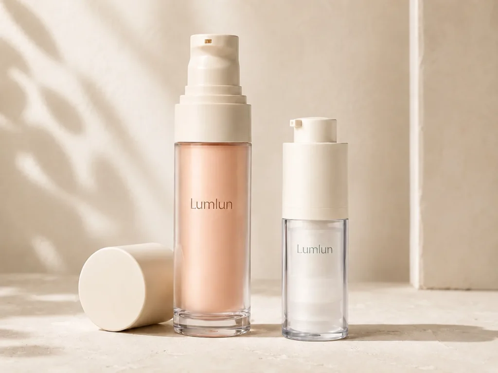
A plastic airless bottle can present a very different but equally deliberate brand direction. Opaque matte colors, soft gradients, thick-wall effects and coordinated pumps can create a modern clinical, minimalist or playful look. Plastic also gives brands more freedom to use one color system across a larger family of shapes and capacities.
The choice should be made with the whole line in mind. A hero serum in a glass-outer bottle may work well beside a cream jar and eye treatment, while a broad facial-and-body range may benefit from a lighter plastic family that can extend across several sizes. Neither route is universally better.
What Does “Glass-Outer Airless Bottle” Actually Mean?
The phrase usually describes the visible shell, not a promise that every formula-contact component is glass.
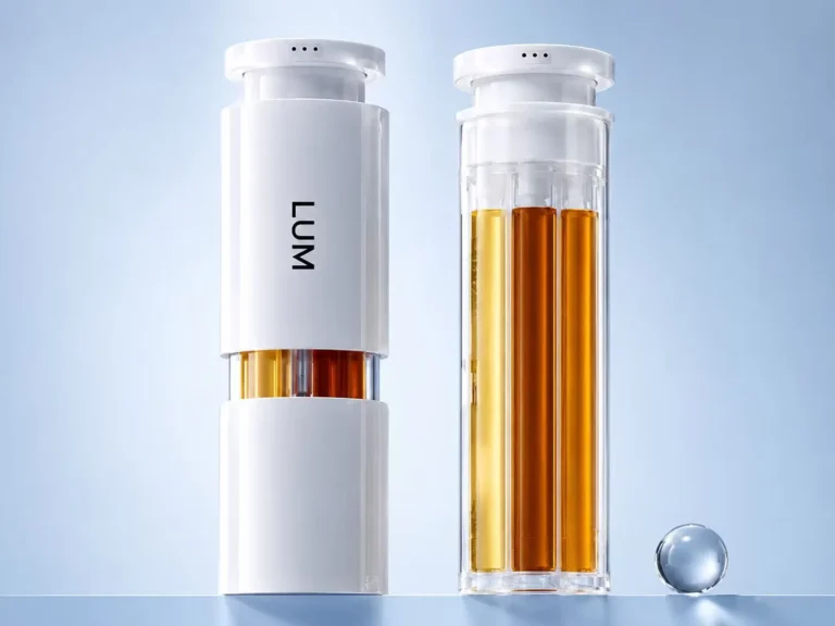
Airless packaging relies on an internal dispensing system that moves product toward the pump without a conventional dip tube. Depending on the model, the formula can be held in a PP inner bottle or another model-specific contact structure, while the outer shell provides the appearance, weight and protection around that inner system. The selected drawing, component list and sample are the reliable sources for the actual construction.
This distinction matters for accurate product copy. A brand can describe a glass outer, glass-look wall or premium outer shell when those statements match the selected packaging. It should not state that the formula is stored directly in glass unless that is true for the complete model. Clear language protects the brand from building a marketing story around an assumption.
The same caution applies to clear plastic. A thick transparent shell can look like glass in photography, but material claims must follow the actual specification. Visual similarity is useful for design; it is not evidence of composition.
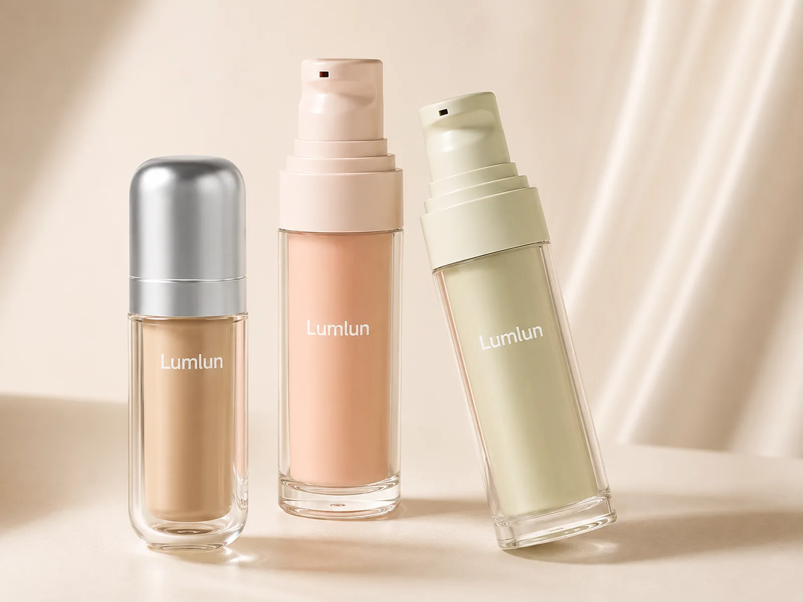
How Do Glass-Outer and Plastic Airless Bottles Create Different First Impressions?
Glass outer tends to communicate depth and substance; plastic tends to communicate control, color and a cleaner engineered appearance.
Customers rarely identify every material correctly from an image, but they do read visual cues. A clear thick wall can make the product look layered and substantial. Frosting softens the view of the inner bottle. Weight can make the package feel more permanent in the hand. These cues are especially noticeable for treatment products that are photographed close-up or presented in a rigid gift box.
Plastic creates its own set of cues. A seamless opaque body can make a product look precise and modern. A mono-color pump and bottle can feel quiet and architectural. A transparent cap over a matte bottle can add depth without the mass of a glass shell. The strength of plastic is not that it imitates glass; it is that it can support many visual languages.
The first impression should match the formula story and the rest of the range. A botanical serum does not automatically need glass, and a clinical treatment does not automatically need plastic. Proportion, finish, type hierarchy and color often matter more than the material name.
Which Option Better Fits the Product’s Price Position?
Price position is supported by the complete package, not by the outer material in isolation.
Glass-outer packaging may support a higher-value presentation when the extra wall depth, weight and finish are visible and meaningful to the customer. It can be especially effective when the bottle is a hero object in product photography or a gift set. The decision still needs to fit the formula quantity, secondary packaging and total project cost.
Plastic can also support premium pricing when the bottle has strong proportions, a refined pump head, controlled decoration and a coherent product story. Thick-wall plastic, PMMA-like clarity, soft-touch matte coating, a metallized collar or a precise gradient can create a high-value impression without relying on weight. A poorly coordinated glass bottle can look less premium than a well-designed plastic one.
Instead of asking which material “looks expensive,” ask what customers will actually see and touch: wall depth, surface, pump action, cap fit, logo quality and the relationship to the rest of the line. Those are the elements that make the price story believable.
Share the airless bottle look you prefer or one reference image. We can help compare existing glass-outer and plastic options without asking you to finalize every detail first.
What Will Customers Notice About Weight, Transparency and Surface Feel?
The customer notices the assembled package: how it feels when lifted, how the wall catches light and how the surface behaves in the hand.
Weight can make a small treatment bottle feel substantial, but it can also increase the weight of a multi-piece gift set. Transparency can display the inner bottle, piston or formula color depending on the construction; it can also expose visual details the brand may prefer to hide. Frosting and opaque coatings give more control over what is visible.
Surface feel changes the daily interaction. High gloss reflects light and can look crisp in a clean color palette. Matte coating creates a softer visual and hand feel, but the selected process should be reviewed for handling, abrasion and decoration adhesion. Metallized parts add contrast and can become a recognizable brand detail when used consistently rather than as decoration for its own sake.
A physical sample is the best way to compare these cues. The first conversation does not require the brand to complete a test plan; it only needs to identify which visual and tactile direction matters. LumLun can then narrow models for sample review.
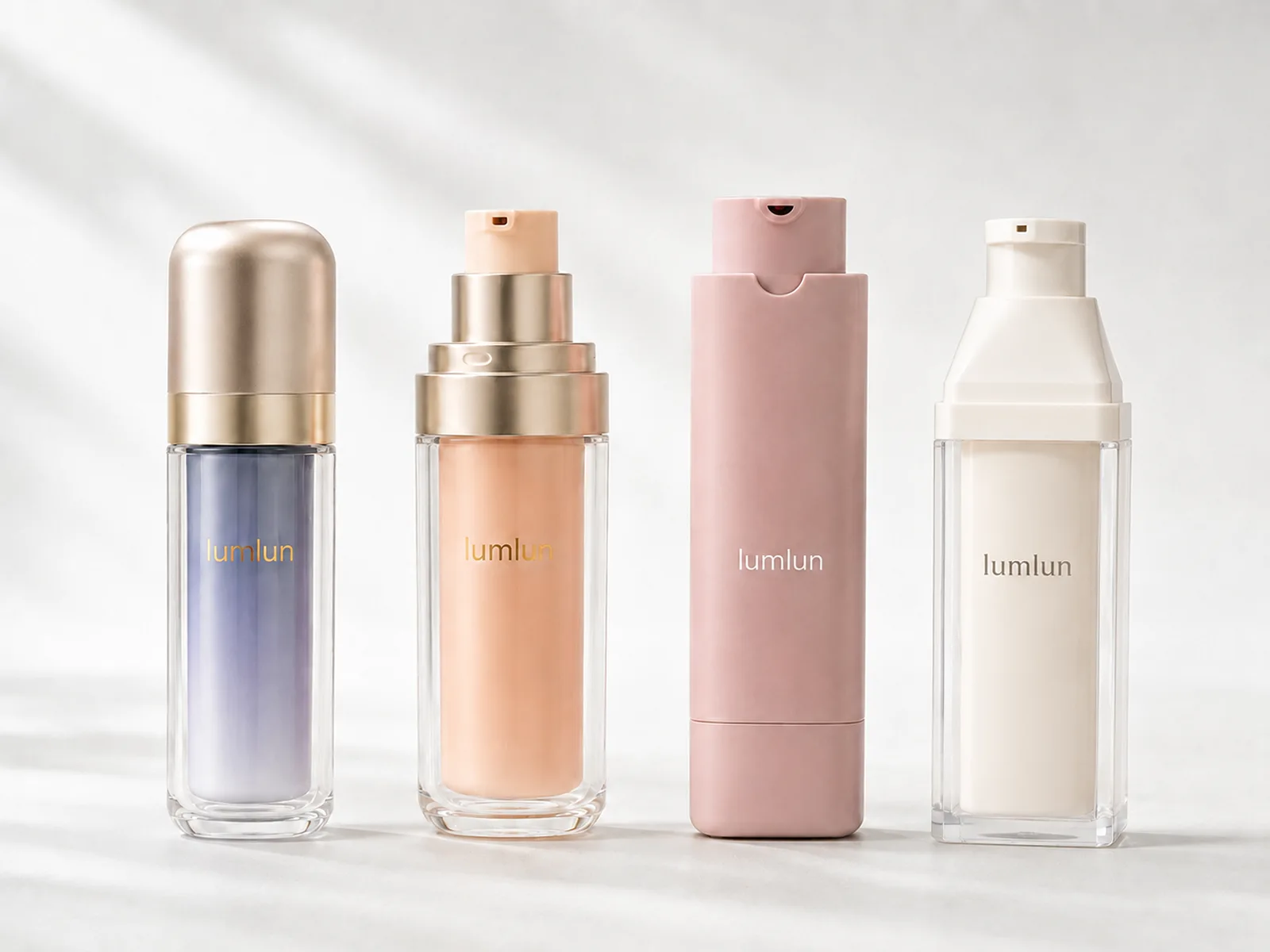
How Will Each Bottle Look in Product Photos, Retail Displays and Gift Sets?
Glass-outer and plastic bottles behave differently in light, grouping and secondary packaging, so the channel should be part of the shortlist.
A clear outer shell can produce attractive highlights and visible depth in studio photography. It can also create reflections that need controlled lighting. Opaque plastic gives the photographer a cleaner color block and can make SKU differentiation easier when several shades are used. Both directions can work online; the stronger choice is the one that remains readable at thumbnail size.
In retail, a heavier bottle can feel substantial when picked up, while a lighter family may create a cleaner, more uniform shelf block. In gift sets, the outer diameter and weight influence the insert, box depth and shipping pack. A glass-outer hero product may be paired with lighter secondary SKUs to keep the set balanced.
Use the actual assembled dimensions when planning the box. A beautiful concept can become crowded if the cap, pump or protective insert is larger than expected. The bottle and box should be designed as one presentation, not as separate projects.
What Can Be Customized on Glass-Outer and Plastic Airless Bottles?
Both directions can be distinctive, but the available processes depend on the real outer material, wall geometry and component construction.
- Color: transparent tint, opaque Pantone color, spray coating or gradient may be possible by model.
- Surface: glossy, matte, frosted or soft-touch directions depend on the substrate and approved process.
- Branding: silk-screen printing, hot stamping and other decoration should be matched to the printable area.
- Components: pump, collar, base and cap colors can be coordinated where the selected model allows.
- Product-line system: one finish hierarchy can connect bottles with jars, tubes or droppers even when the structures differ.
Review the available LumLun customization and finishing directions after the bottle family is chosen. This avoids designing an effect that cannot be applied consistently to the real surfaces.
How to Build a Complete Skincare Line Around the Chosen Look
Build one recognizable design language, then decide which SKUs need the heavier hero treatment and which need a lighter supporting format.
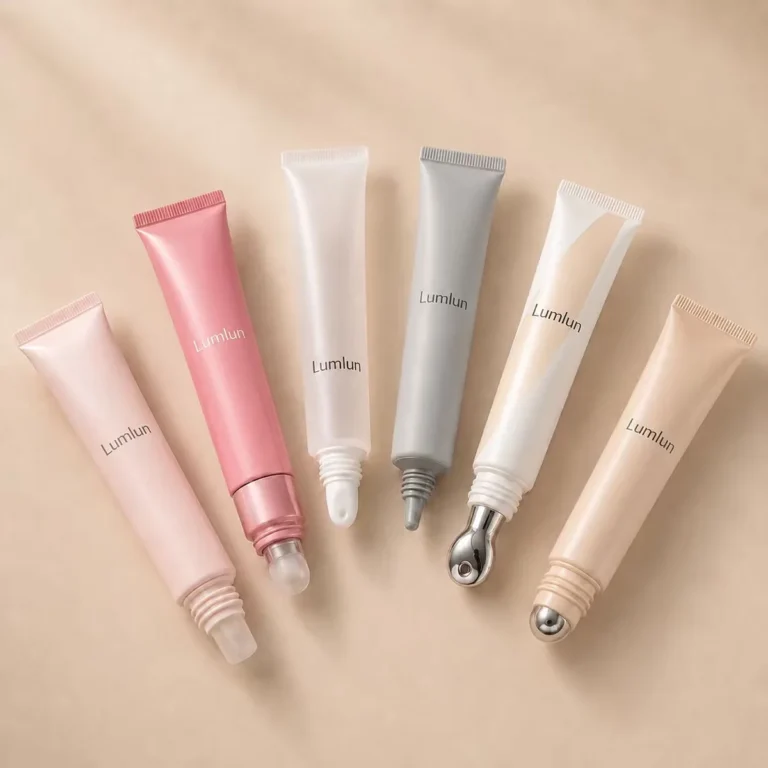
A complete line does not need every package to use the same outer material. A glass-outer airless serum can sit beside a plastic airless eye treatment, a cream jar and a tube when the color, typography, finish and component accents are coordinated. The reverse is also true: a plastic airless family can carry the core line while one gift-set hero uses a glass outer.
The most useful shared elements are often the quiet ones: the same logo position, one metallized tone, a controlled matte-to-gloss rule, related cap shapes and a consistent hierarchy between brand and product name. This creates recognition without forcing physically different packages to look identical.
Before approving the range, place the proposed packages together in a visual lineup and a box mock-up. The goal is to confirm that the hero product stands out without making the supporting SKUs look unrelated.
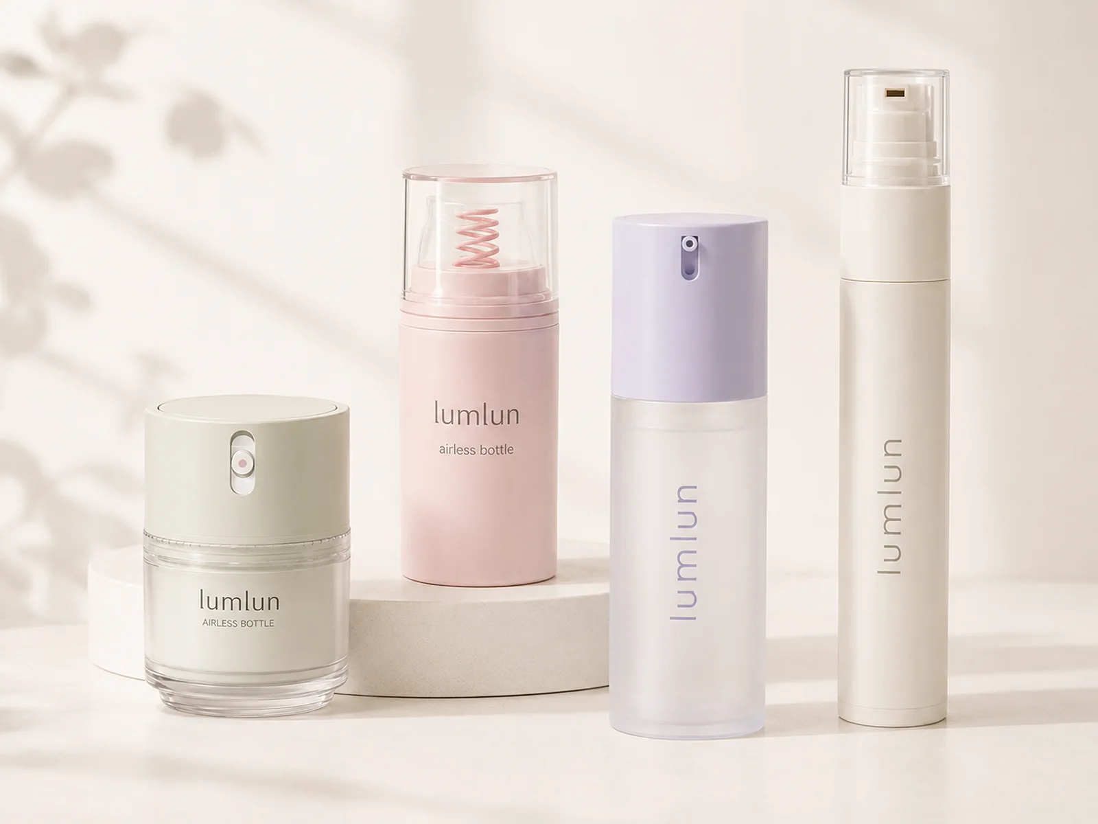
Can an Existing Airless Bottle Match Your Reference Design?
A reference image can be translated into a realistic shortlist by separating the look from the structure.
The visible design may depend on five different decisions: bottle overall shape, wall depth, pump head, cap or collar and surface finish. An existing model may match four of those five points closely enough to create the intended brand impression without custom tooling. Another model may look similar in a front view but use a completely different pump or wall construction.
LumLun can review a reference image and identify the closest available structures, then explain which details can be reproduced through color and decoration. If an exact overall shape or dispensing action is essential and no existing model fits, custom tooling can be evaluated as a separate commercial decision.
The responsible promise is not “we can copy any bottle.” It is “we can help determine the closest realistic route and show where the selected structure will differ.” That clarity reduces late redesign and keeps the visual goal connected to a manufacturable package.
Glass-Outer or Plastic Airless: How to Make the Final Choice
Choose glass outer for visible depth and weight when those cues are central; choose plastic for lighter handling, color control and scalable family design.
A glass-outer direction is strongest when the product is a hero treatment, the bottle will be handled as a premium object and the gift or retail presentation can support the added weight and wall diameter. A plastic direction is strongest when the brand needs several coordinated capacities, strong color blocking, lighter e-commerce handling or a cleaner engineered look.
There is also a middle ground: thick-wall transparent plastic, frosted shells and metallized details can create depth without using a glass outer. Compare real samples before deciding because photography alone cannot communicate weight, cap fit and surface feel.
The final choice should make the brand story easier to understand and the product line easier to execute. Material language is useful, but the customer buys the complete experience.
Decision Table
Which outer direction fits the project?
| Project priority | Stronger starting direction | Why | Boundary to remember |
|---|---|---|---|
| Visible wall depth and weight | Glass outer | The package can feel more substantial and display clear or frosted depth | The formula may still sit in a separate internal airless bottle |
| Broad color system across many SKUs | Plastic | Color and finish can be coordinated across more shapes and capacities | The exact finish depends on material and surface |
| E-commerce and lower pack weight | Plastic | Lighter handling can simplify the complete pack direction | Secondary packaging and real transport testing still matter |
| Premium gift set or hero treatment | Glass outer or a thick-wall plastic model | Both can create a strong presentation when the structure and finish are considered | Do not use “glass” as a substitute for good proportion and artwork |
Final Recommendation
Use glass outer when visible wall depth, weight and a hero-product presentation are essential to the offer. Use plastic when the project benefits from lighter handling, broad Pantone control and easier expansion across a coordinated range. Confirm the formula-contact structure and material claims from the selected model, not from appearance.
Frequently Asked Questions
Is a glass airless bottle made entirely of glass?
Usually not. “Glass-outer” commonly means the visible outer shell is glass while an internal airless bottle and pump hold and dispense the formula. The selected model’s contact materials should be confirmed.
Does the formula directly touch the glass outer bottle?
Not necessarily. In many glass-outer airless designs, the formula is contained in an internal bottle. The outer glass provides appearance and weight rather than direct formula contact.
Can plastic airless packaging look premium?
Yes. Premium appearance can come from wall design, proportion, matte or glossy finish, gradient color, metallized details, pump coordination and precise logo placement.
Which direction offers more appearance customization?
Both can be customized, but plastic often supports broad opaque color matching and coordinated multi-capacity ranges. Glass-outer designs can create distinctive clear, frosted and depth effects.
Which direction suits premium skincare gift sets?
Glass-outer packaging can add weight and visual depth to hero products. Plastic can be easier to coordinate across several items. The final choice depends on box structure, range consistency and desired handling.
AIRLESS PACKAGING OPTIONS
Compare Airless Bottle Options for Your Skincare Line
Browse LumLun airless packaging, send the bottle you like, or share one reference image. The remaining structure, color and project details can be discussed later.