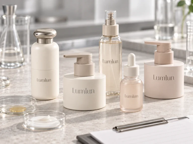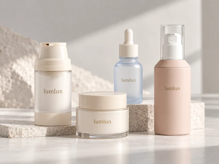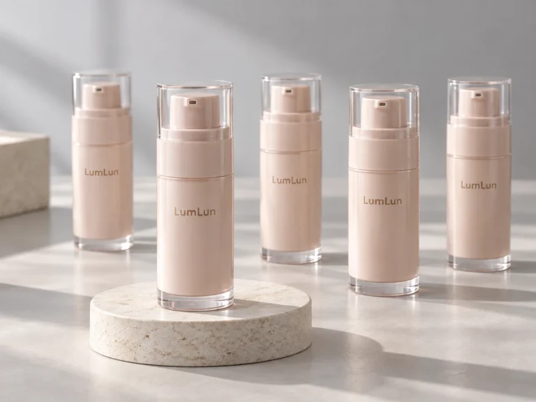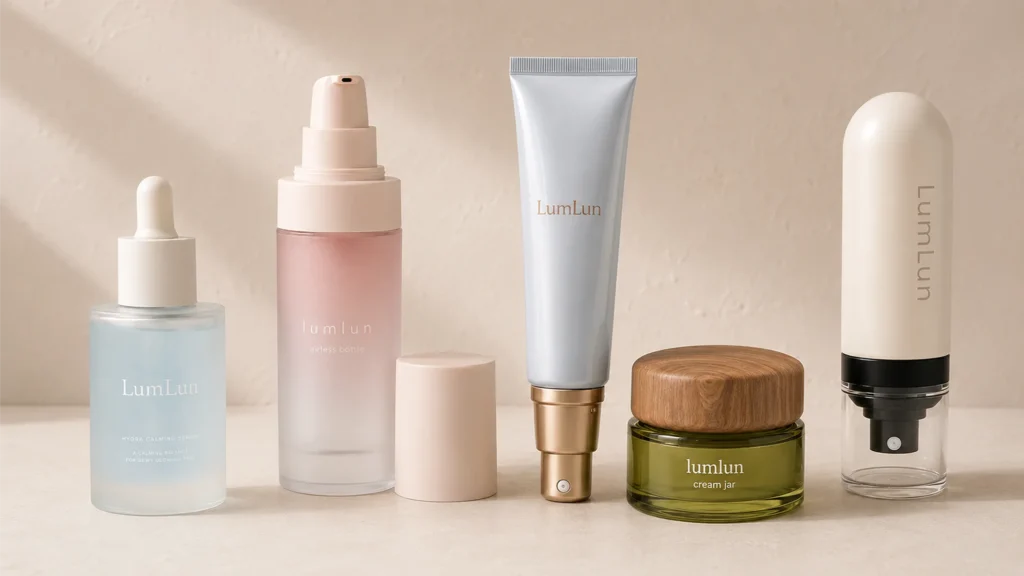
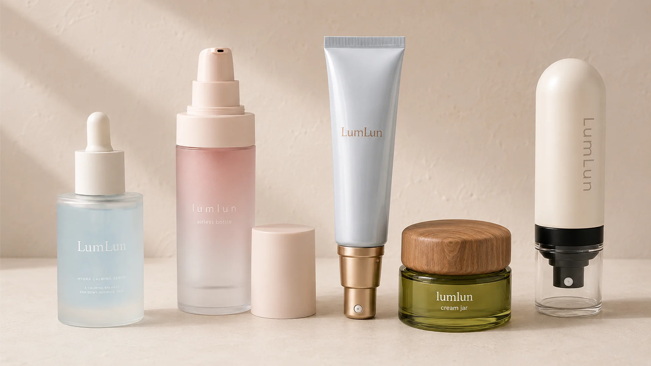
Cosmetic packaging finish is not one decision. A finished pack can combine base material color, surface treatment and printed or applied decoration. Separating those layers makes it easier to choose what is realistic on a bottle, jar or tube and prevents one visual reference from being treated as a single process.
For skincare packaging, the most useful comparison is practical: what effect the process creates, which surface it needs, where artwork can sit and whether the exact product model supports it.
A reference image may contain several processes at once: a colored body, a matte coating, a metallic logo and a clear cap, for example. Breaking the reference into those visible layers makes it much easier to find an existing model and determine which effects are decoration and which are part of the molded component.
LumLun currently presents eight main decoration and finish directions for cosmetic packaging: Hot Stamping, Spray Color, Silk Screen Printing, Metallization, Gradient Color, Glossy Finish, Matte Finish and Hydrographic Printing. Molded-in or injection color is a separate base-color route on compatible plastic components; labels are another artwork route when the selected pack has a suitable label area. Keeping these categories separate makes a reference image much easier to translate into production steps.
Separate Base Color, Surface Finish and Printed Decoration
Base color is the color of the molded or formed component itself when the selected material and production route allow it. It can be a useful direction when the project needs consistent color across the bottle body, cap, jar or tube component.
Surface finish changes the appearance or feel of the outside surface. Matte, glossy, frosted, coated, metallized or soft-touch-like effects can come from different processes depending on the material and model. The visual word alone does not identify the manufacturing process.
Printed decoration adds logos, product names, lines, symbols or other artwork. Screen printing, hot stamping and labels solve different artwork jobs and need different surface areas.
| Layer | Typical question | What to confirm |
|---|---|---|
| Base color | Should the component itself be colored? | Material, molded-color availability and color reference |
| Surface finish | Should the surface look matte, glossy, frosted or coated? | Exact substrate, geometry and available finish process |
| Printed / applied decoration | How should logo and product information be added? | Printable area, artwork detail, color and process |
Choose Matte, Glossy, Frosted and Coated Effects by Material and Surface
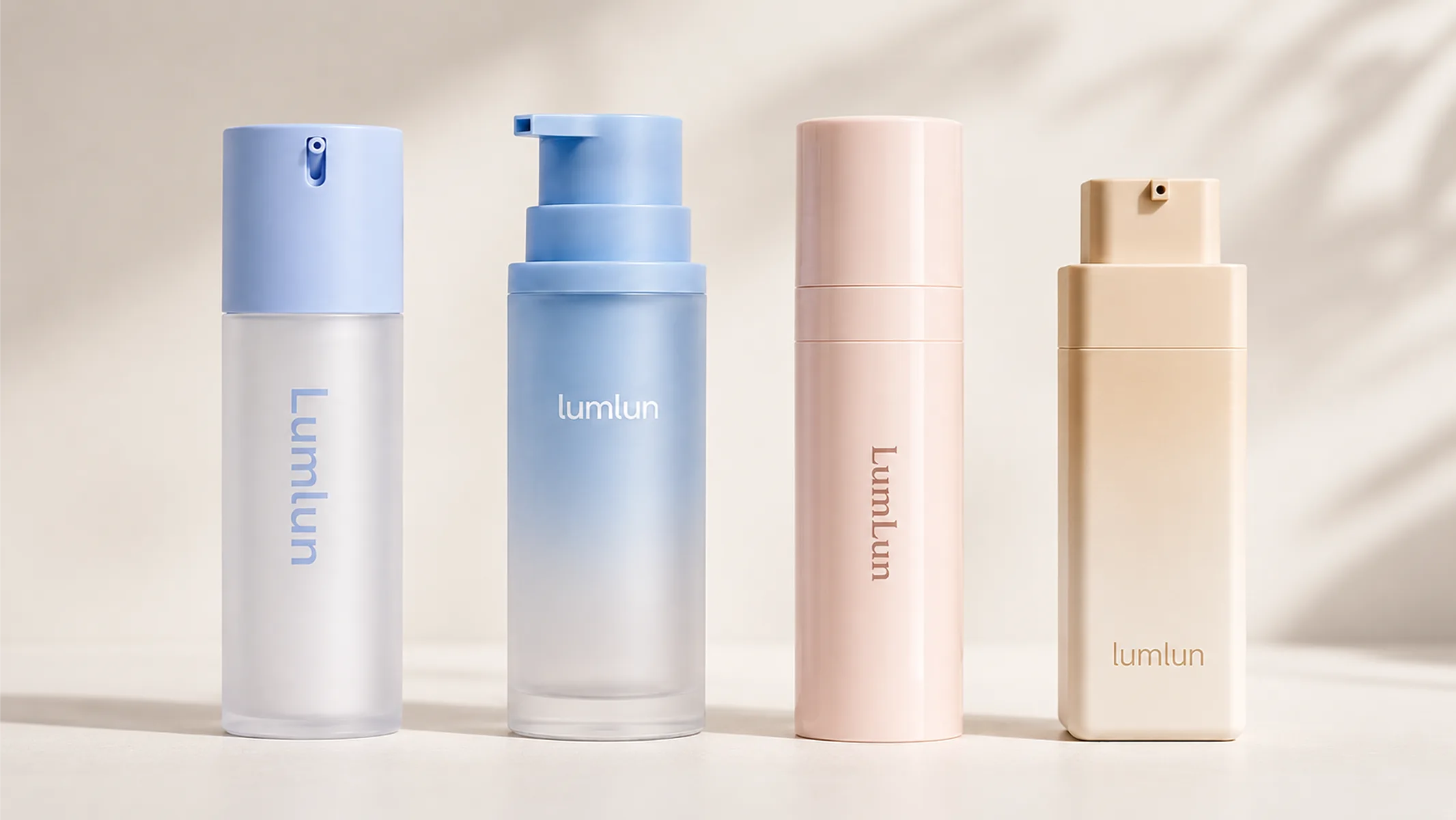
“Matte” and “frosted” are often used loosely, but they can describe different visual routes. A matte effect reduces visible gloss; a frosted effect often keeps some translucency or creates a diffused surface appearance. Glossy surfaces reflect more light and can make color appear more saturated. Coatings can add effects that are not created by the raw material alone.
The finish name is not enough to approve production. Confirm the exact model, material and reference effect. The same matte description can look different on PP, PETG, glass or a coated component because the starting surface and wall construction are different.
Transparent and translucent packs need extra attention because surface finish interacts with what is visible underneath. A frosted outer wall may still show an inner bottle or formula color; an opaque molded component will not create the same layered appearance.
If color accuracy matters, the color reference should be reviewed on the intended process and substrate. Injection color, coating color and printed color are different production routes and should not be treated as interchangeable simply because the same Pantone reference is used.
The same point applies to gloss level and transparency. A matte molded PP component, a coated PETG bottle and frosted glass can all be described with similar visual words while producing different light transmission, edge definition and surface feel. Approve the real effect, not only the vocabulary used to describe it.
Spray Color is useful when the visible component needs a specific surface color, broader coverage or a matte/gloss direction that cannot be achieved by the raw material alone. Gradient Color adds a controlled transition rather than one flat color. For both, the target Pantone is a reference point, not proof that every substrate will look identical; the same color can shift with transparency, base resin and gloss level.
Handling matters too. A glossy surface gives stronger reflection and can make color look more vivid, but fingerprints and reflections are usually more visible. A matte finish reduces glare and can make handling marks less obvious in some colors, but dark matte surfaces can still show oil, dust or rub marks. Matte is not fingerprint-proof, and glossy is not automatically harder to maintain.
Use Screen Printing, Hot Stamping and Labels for Different Jobs
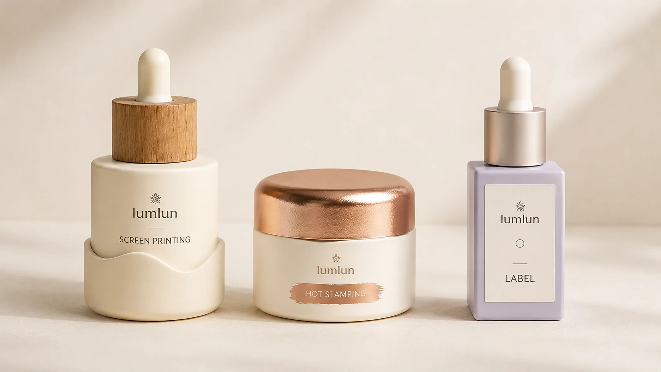
Screen printing is useful for direct logo, product-name and simple graphic areas on compatible packaging surfaces. It works best when the printable area and artwork detail suit the screen and container geometry.
Hot stamping adds a transferred foil effect and is often used for a logo, line or selected accent rather than every piece of information. Very curved, narrow or interrupted surfaces can limit the practical stamping area.
Labels can carry more information or complex graphics when a suitable label panel or wrap area is available. They also introduce label material, edge, adhesion and placement as part of the finished look.
A project can use more than one process—for example, molded color plus screen printing, or coating plus hot stamping—but each added process should have a clear visual job. More processes do not automatically create a better pack.
When information density is high, use the process that keeps the required copy readable. A small hot-stamped logo can work well as an accent, while ingredients, directions or dense regulatory text are usually better handled by a printing or labeling route appropriate to the exact package and market requirements.
Decoration also has to respect component breaks. A logo that crosses a removable cap line, shoulder or refill seam may not read as one continuous mark after assembly. Place critical artwork on a stable surface whenever possible.
For normal front-panel text, product names and simple logos, Silk Screen Printing is often the most direct route when the surface and artwork suit it. Hot Stamping is better treated as a localized metallic accent—such as a logo, line or selected wording—rather than the default method for dense information.
Metallization is different again: it can give an entire pump, collar, cap or other confirmed component a continuous metallic appearance. Labels remain useful when the pack needs more text, complex graphics or an artwork route that is better handled on a label panel.
None of these is automatically the “premium” process. A restrained hot-stamped logo can suit a high-end serum line; a full metallized pump can create a stronger metal-like component; a clean silk-screen layout can be more appropriate for a minimal formula-led range. The choice should follow the visual job and available surface.
Let Package Geometry Decide the Artwork Area
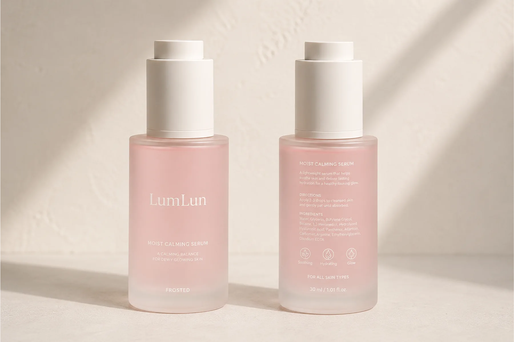
A tall cylindrical bottle, square airless bottle, soft tube and wide cream-jar lid do not give artwork the same space. Shoulder curves, seams, pump collars, cap lines and changes in diameter can reduce the usable printing area.
Select the real packaging model before final artwork is locked. Then set logo width, text size, foil area, label dimensions and front/back information around the actual printable region. This avoids forcing artwork onto a model it was not designed for.
For a multi-size family, the smallest capacity is usually the most restrictive artwork surface. A design that works on a 100ml bottle may need different spacing on 30ml. Keep the visual system consistent while allowing the artwork to fit each real container.
A useful artwork system therefore defines what must stay consistent—logo style, core colors, type hierarchy, selected accent—and what can adapt to the package. That gives the designer room to work with actual bottle and jar proportions instead of forcing every SKU into one rigid layout.
Hydrographic Printing is useful when a compatible cap or curved outer shell needs a continuous decorative pattern such as marble or another all-over texture. It is not a replacement for ordinary text printing: pattern scale, seam position and orientation have to work with the component geometry, while product information still needs its own readable artwork route.
Build a Coordinated Finish System Without Forcing Every Pack to Look Identical
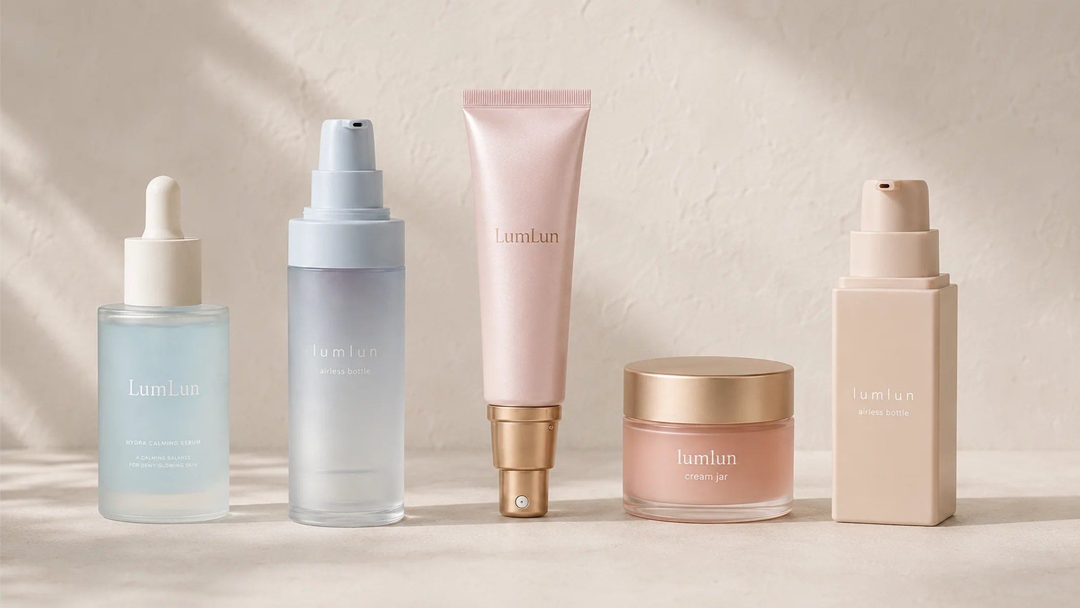
A skincare line may use an airless bottle, cream jar and cosmetic tube together. They do not need identical materials or identical finish processes to look related. A shared color family, logo treatment or selected metallic accent can connect the range while each model uses a process suited to its surface.
For example, an airless bottle may use molded color and screen printing, a cream jar may place hot stamping on the lid, and a tube may use printing on the tube body. Visual consistency comes from the design system, not from forcing one production process onto every component.
Real packaging surfaces can be compared through the Airless Bottle & Jar, Cream Jar and Cosmetic Tube collections before the final finish system is approved.
Finish can also interact with a product-protection brief, but the claim must be specific. A sufficiently opaque full-coverage spray color or a truly metallized outer component can reduce the amount of light reaching an inner package when the complete structure blocks that light. Matte or glossy appearance by itself is not a light barrier, and no finish alone proves formula stability or shelf life. If light sensitivity matters, evaluate the complete pack and the actual formula.
Visual positioning can still guide the shortlist without turning the decision into psychology. Real glass, restrained matte surfaces and localized metallic details can support a more premium material direction; clean silk-screen printing and fewer effects can support a minimal range; vivid spray color, gradient or glossy effects can support a brighter visual system. These are design directions, not guarantees of sales or consumer response.
Confirm the Finish on the Exact Model Before Bulk Production
A finish sample should answer a small number of practical questions: Does the surface effect look right on the selected material? Is the logo position correct? Is the printed or stamped area clear and aligned? Do the visible components match the approved color direction?
This does not need to become a long testing checklist. The aim is to compare the real finished surface with the approved reference and artwork, then keep that approved combination tied to the exact model and decoration specification.
If a finish is not available on the chosen material or geometry, the next step is to adjust the process or compare another real model—not to promise that every visual effect can be reproduced on every package.
For repeat production, keep the approved substrate, color route, finish process and decoration method together. A change from molded color to coating, or from direct printing to a label, can produce a visibly different result even when the artwork file itself has not changed.
For Pantone-critical projects, approve the color on the actual material and finish. A Pantone target printed on paper is not the same thing as spray color on PETG, molded color in PP or a glossy coated part. Physical samples are where color, gloss, metallic tone, fingerprint visibility, logo contrast and the smallest printable area should be judged together.