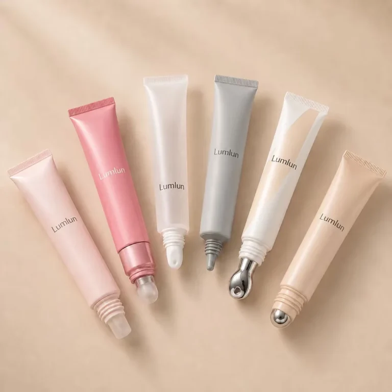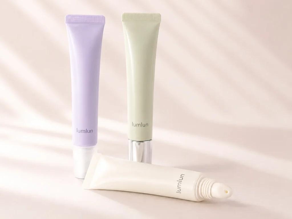
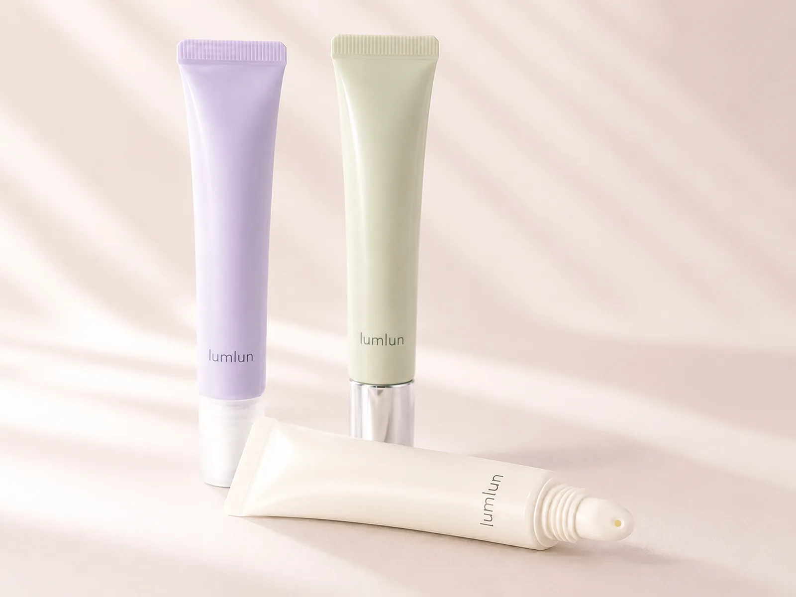
A lip gloss squeeze tube has very little space to communicate, so proportion, applicator, cap and color need to work together immediately. The pack should make the shade or brand direction easy to recognize while still feeling comfortable to hold, squeeze and apply.
The best result comes from designing the whole experience rather than choosing the tube body alone. Tube softness, opening size, direct-application tip, transparency, logo placement and cap finish all influence how polished the product looks online and how controlled it feels during use.
The current LumLun cosmetic tube models provide the starting structures, while the guide to cosmetic tube applicator types helps separate the tip decision from the tube color and finish.
Reviewed by the LumLun Packaging project team · Updated July 2026
Key Takeaways
- Design the tube and applicator as one system. The opening, tip, squeeze response and formula flow shape the application experience.
- Make shades easy to recognize. Transparent, translucent or coordinated colors can help distinguish a lip gloss range.
- Keep the small front panel disciplined. Logo scale and artwork spacing have a strong effect on perceived quality.
- Choose cap details that support the positioning. Clear, colored and metallic-effect caps can change the overall impression without changing the tube structure.
- Use real tube proportions in product planning. A reference image should be matched to an existing model before artwork is adapted.
Decision Table
Lip gloss squeeze tube design snapshot
| Decision | Direction 1 | Direction 2 | What the customer notices |
|---|---|---|---|
| Tube appearance | Clear or translucent body | Opaque or brand-colored body | Whether the shade is visible or the brand color dominates |
| Applicator | Rounded or slanted direct-lip tip | Soft silicone or model-specific specialty tip | Comfort, spread and control at the lip surface |
| Body feel | Softer squeeze response | Firmer, more controlled body | How easily the gloss is released and whether the dose feels predictable |
| Cap direction | Clear or color-matched cap | Metallic-effect or contrasting cap | Portability, opening action and perceived finish quality |
Is a Squeeze Tube the Right Experience for Your Lip Gloss?
A squeeze tube is a strong fit when direct application, portability and a simple cap-and-squeeze routine support the product.
Unlike a wand package, the tube can let customers apply the gloss directly from the outlet. That reduces the number of separate components and creates a compact object that is easy to carry. It can suit clear glosses, lip oils, balms and tinted gloss directions when the actual formula and applicator are compatible.
The format is not automatically right for every gloss. A very fluid formula may release too quickly through a wide opening, while a very thick formula may require too much squeeze force. Highly pigmented products may need a more controlled applicator and clearer cleaning behavior. These are model-fit questions that can be narrowed after the brand shares the formula direction.
The key benefit is the combined visual and use experience. The tube should look like a deliberate lip product, not a generic mini cosmetic tube with a different label. Proportion, applicator and cap are what create that distinction.
What Makes a Lip Gloss Squeeze Tube Worth Picking Up?
The tube needs a clear overall shape, an understandable shade story and one detail that makes the product feel considered.
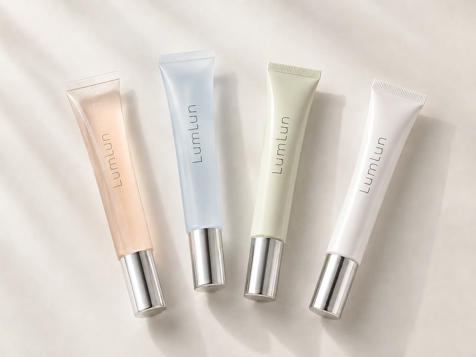
At retail or in a social image, customers first read color and proportion. A slim tube can feel portable and refined. A shorter, wider tube can feel more substantial. A visible gloss shade can create immediate appetite, while a soft opaque color can make the brand system more recognizable. The choice should be intentional rather than based on whichever blank tube is available.
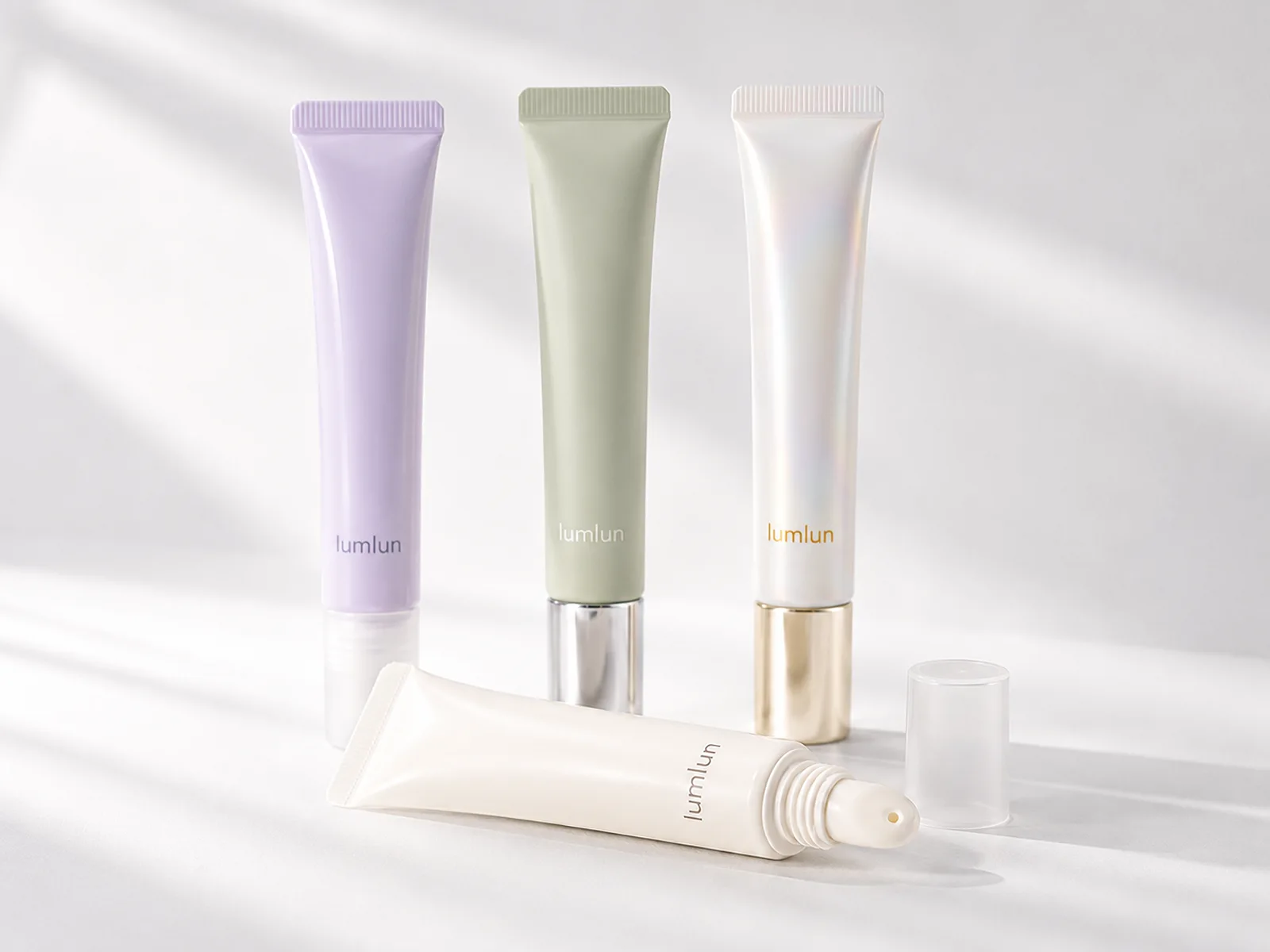
The cap can become the recognizable detail. A clear cap keeps the look light and lets the applicator remain visible. A metallic-effect cap adds contrast and can help the product feel giftable. A color-matched cap creates a quiet, modern block. The finish should support the brand position without making the tube visually busy.
Online, the LumLun logo, tube color and applicator should remain legible in a thumbnail. If the tube only looks distinctive in a close-up, the brand may need a stronger color rule or cap detail.
Which Applicator Tip Fits the Lip Experience You Want?
Choose the tip by how the gloss should spread, how much product should be released and how the surface should feel against the lips.
A rounded direct-lip tip can feel soft and familiar. It can suit balmy or glossy formulas that spread easily. A slanted tip can create a more defined contact surface and help the customer guide the product along the lip. A soft silicone direction can add a more sensorial feel and may be easier to wipe clean, depending on the exact model.
The opening size matters as much as the outer shape. A small outlet can control a flowing gloss but may make a thicker formula slow to dispense. A larger outlet can release a rich gloss more easily but may over-dose a thin formula. The tube, tip and formula should therefore be treated as one dispensing system.
Only use tip claims that match the selected model. The LumLun applicator guide is useful for comparing rounded, slanted, silicone, roller and other directions before narrowing the lip-specific shortlist.
How Should the Tube Feel When Customers Squeeze and Apply It?
The tube should release the gloss with controlled pressure and recover cleanly without making the customer fight the package.
A very soft body can feel easy to squeeze, but it may release too much product if the outlet is also large. A very firm body can improve control, but it can become tiring or feel unfinished if the customer must press hard. The ideal response depends on wall structure, diameter, formula texture and the amount expected per use.
Recovery also affects the experience. After the customer releases pressure, the body should return without drawing visible mess around the outlet. The cap should close without pushing product out, and the thread or snap action should feel secure enough for a handbag. Those small details are more important to repeat use than decorative language on the front panel.
Brands do not need to complete compatibility work before contacting LumLun. The first step is to share whether the gloss is fluid, medium or thick and whether direct application is essential. That is enough to narrow the first model group.
Share the LumLun tube you like or one reference image. We can help compare tube proportions, applicator styles and finish options for the lip gloss experience you want.
Clear, Translucent or Colored: How Should the Shade Be Presented?
Use transparency when the formula color is a selling point; use colored packaging when the brand system should dominate the first impression.
A clear tube can make a shade range easy to understand and can be especially effective for tinted glosses with visible color differences. A translucent tube softens the formula view and can create a more skincare-like effect. An opaque tube protects the visual system from formula variation and gives the brand full control over the color block.
The decision also affects product photography. Clear tubes can show the gloss beautifully, but reflections and fill appearance need controlled lighting. Soft opaque colors create consistent thumbnails and make metallic or clear caps more noticeable. A mixed system can work when the brand uses a translucent body for the range and a small color code or cap detail for each shade.
Do not claim that a colored tube provides a specific protective function unless the selected material, color and product requirements support that claim. In this article, color is treated as a design and SKU-recognition decision.
Which Size and Proportion Balance Portability and Product Value?
A slim portable tube should still feel substantial enough to carry readable artwork and a secure cap.
Lip gloss squeeze tubes are often compact, but a small nominal capacity can appear very different depending on diameter, shoulder length and cap height. A long narrow tube may look elegant and provide a vertical branding area. A shorter tube may feel more playful or substantial. The selected proportion should fit the brand and the expected use, not only the fill volume.
Portability depends on more than length. Cap security, the possibility of accidental squeezing and the shape of the tube in a pocket or bag all matter. A metallic-effect cap can add weight and visual value, but the complete assembly must remain balanced. A clear cap may make the tube feel lighter and more cosmetic.
The front panel should have room for the brand, product name and any required information without crowding. If the tube is too narrow for the planned copy, simplifying the artwork may create a stronger result than increasing the number of lines.
How to Make a Lip Gloss Shade Range Easy to Recognize and Collect
Keep one recognizable tube system and use a controlled shade code so customers can see both the brand family and the individual SKU.
- Repeat the same overall shape and cap family so the range is recognizable even when shades change.
- Use formula visibility, tube color, cap color or a small printed code as the shade differentiator rather than changing every design element.
- Keep the logo and product-name hierarchy stable so the customer scans the range quickly.
- Photograph the shades together to confirm that pale colors do not disappear and dark colors do not dominate the whole set.
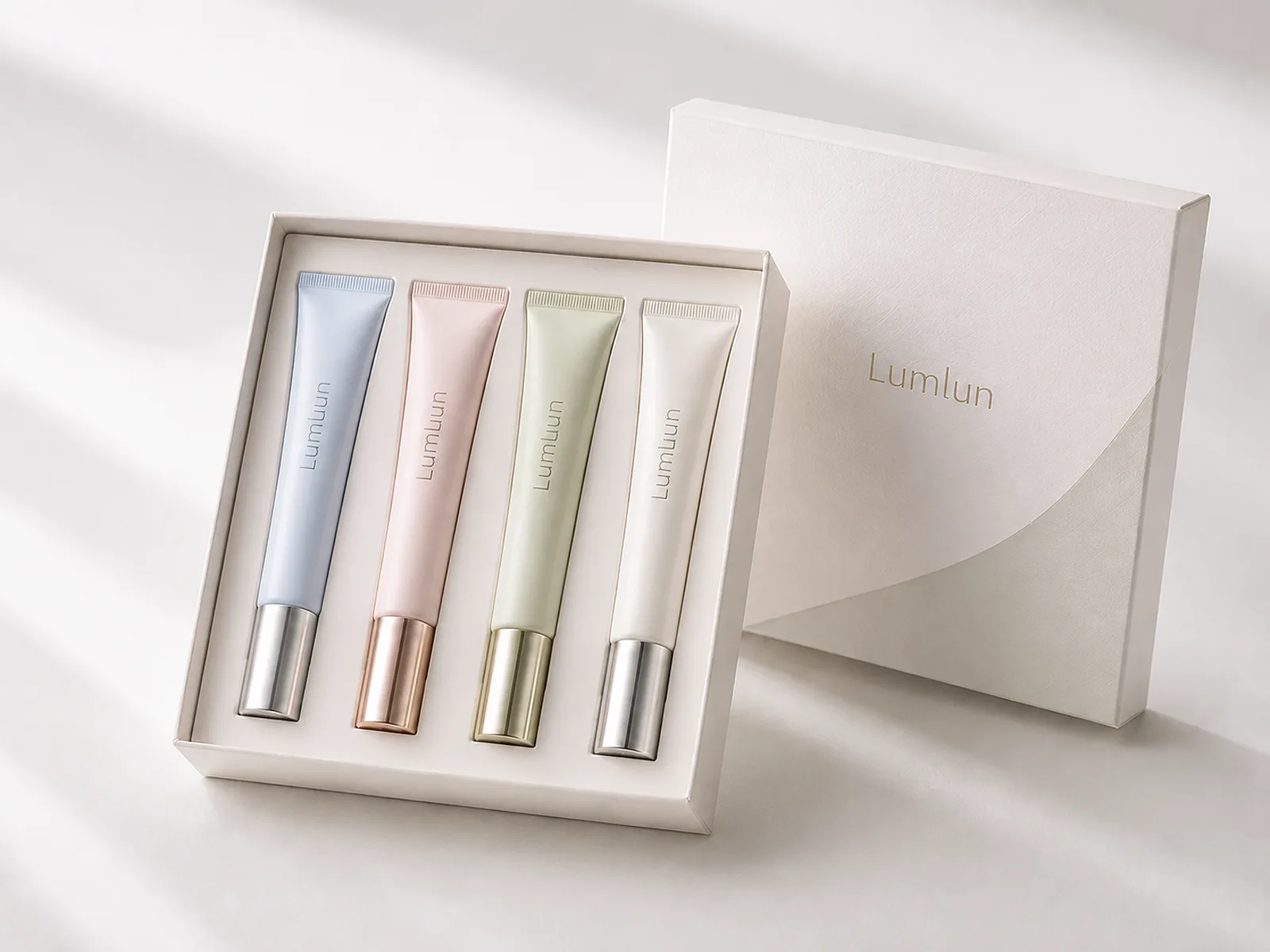
- Design the gift tray around the real tube and cap dimensions so the set feels precise rather than improvised.
A collectible range does not require novelty for every shade. Consistent structure gives the brand memory; controlled variation gives the customer a reason to explore the range.
How Can the Cap, Logo and Finish Strengthen the Brand Look?
The cap is the strongest hard component on a soft tube, so it should be designed as part of the brand rather than treated as an afterthought.
A clear cap can show the applicator and keep the package light. A color-matched cap creates a seamless effect. A silver, gold, rose or other metallic-effect cap can introduce a premium accent, especially when the logo or secondary box repeats the same tone. The process and color need to be confirmed on the selected cap material.
The logo should be sized for the actual tube curvature. Large vertical branding can create strong shelf recognition, while a smaller centered logo may support a quieter skincare-lip position. Silk-screen printing, hot stamping, soft color gradients and pearl effects can create differentiation where the model and surface allow.
Review LumLun finishing and color directions after the tube and cap are selected. This keeps the design connected to a real printable surface and avoids planning details that will not reproduce consistently.
How Will the Tube Look in Product Photos, Social Content and Gift Sets?
The tube should remain readable alone, attractive in a color lineup and physically believable in a gift set.
For product-page images, show at least one clear front view, one cap or applicator detail and one lineup that explains shade differences. A direct-lip tip can be a strong visual because it immediately shows how the product is used. The image should not create an applicator or cap that the real product does not have.
In short-form content, squeezing and direct application can demonstrate the product in seconds. The tube color and cap should remain recognizable under different lighting. For gift sets, the tray needs to hold each tube securely while allowing the color range to be seen. A box that covers most of the tube can remove the very shade visibility the package was designed to create.
The packaging should help the customer understand the range before opening the product. That is the commercial value of a coordinated image system: it reduces confusion and gives the brand more usable content across online, retail and gifting.
How to Turn a Reference Image Into a Custom Lip Gloss Tube
Separate the reference into the tube body, applicator, cap, color, finish and artwork before deciding whether an existing model can deliver the look.
A reference image may look simple but combine a unique cap, a specific tip and a custom proportion. LumLun can identify which details are structural and which can be recreated through decoration. An existing tube may match the overall shape and accept a different cap or finish; another may match the tip but have a different shoulder.
The practical route is to shortlist real tubes first and compare them against the visual priorities. If the brand must reproduce an exact shape or closure and no available model is acceptable, tooling can be evaluated. Most differentiation, however, can begin with a suitable existing structure and a controlled brand system.
Send the image even if the exact capacity or material is not known. The first response can focus on what the image communicates and which LumLun models are closest.
Decision Table
How to choose the final lip gloss tube direction
| Product goal | Recommended starting direction | Why it fits | Watch for |
|---|---|---|---|
| Show a visible shade range | Clear or translucent tubes with coordinated caps | Customers can identify the color while the shared cap system holds the range together | Formula appearance must remain attractive and shade differences must be visible online |
| Build a strong brand color block | Opaque or softly colored tubes | The brand owns the shelf impression even when shades are similar | Use shade names, codes or cap details so SKUs remain easy to distinguish |
| Create a portable everyday gloss | Slim tube with secure cap and comfortable direct applicator | Easy to carry and reapply without a separate wand | Do not sacrifice front artwork or make the tube too hard to squeeze |
| Create a giftable premium set | Coordinated tubes with controlled metallic or clear details | A unified system looks intentional in a tray or box | The insert and cap heights must fit the actual tube dimensions |
Final Recommendation
Use a lip gloss squeeze tube when direct application, portability and a clear shade or brand-color story support the product. Choose the tip, opening, tube response, cap and artwork as one system. A coordinated existing tube can create a distinctive range without requiring a new mold.
Frequently Asked Questions
Which applicator tip suits a lip gloss squeeze tube?
Rounded or slanted direct-application tips are common directions. The best tip depends on lip contact, opening size, formula flow and the selected tube structure.
Can thicker lip gloss use a squeeze tube?
It can, provided the tube wall, outlet and formula flow work together. Thicker formulas may need a different opening or squeeze force, so sample evaluation is important.
Should a lip gloss tube be clear?
Clear is useful when formula shade is part of the product story. Colored or opaque tubes can be better when the brand wants a stronger visual block or consistent appearance.
What size is suitable for an on-the-go lip gloss?
Compact slim tubes are practical for bags and pockets. The final capacity should balance portability, expected usage and enough front area for clear branding.
Can several shades use one tube design?
Yes. A shared tube, cap and logo system can be paired with controlled tint or shade coding so the range remains recognizable and easy to collect.
LIP GLOSS TUBE OPTIONS
Compare Lip Gloss Squeeze Tube Options
Browse LumLun cosmetic tubes or send the tube style you like. You can begin with the desired look or applicator and confirm the remaining details later.