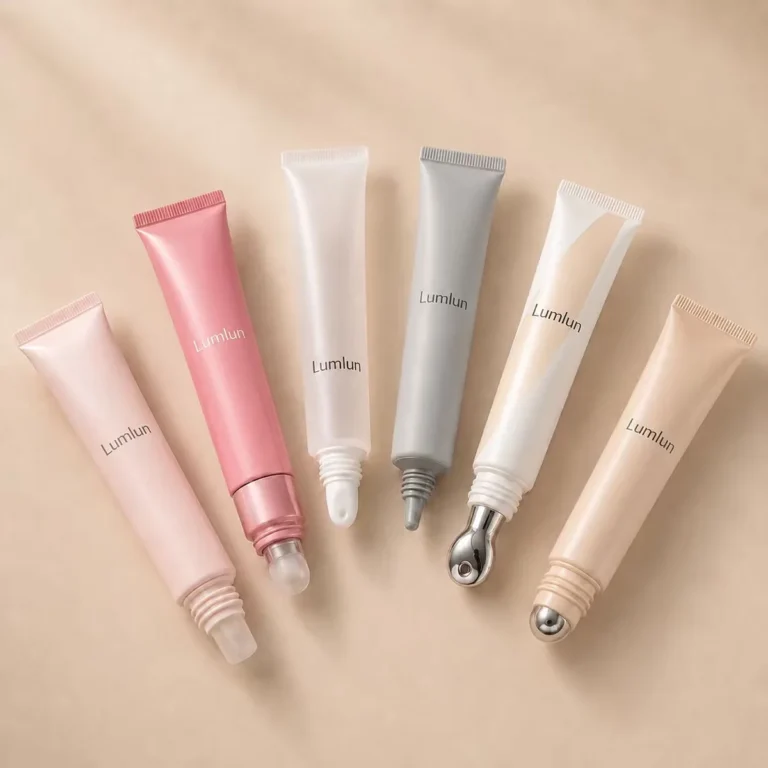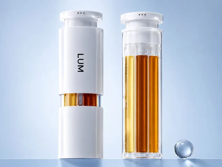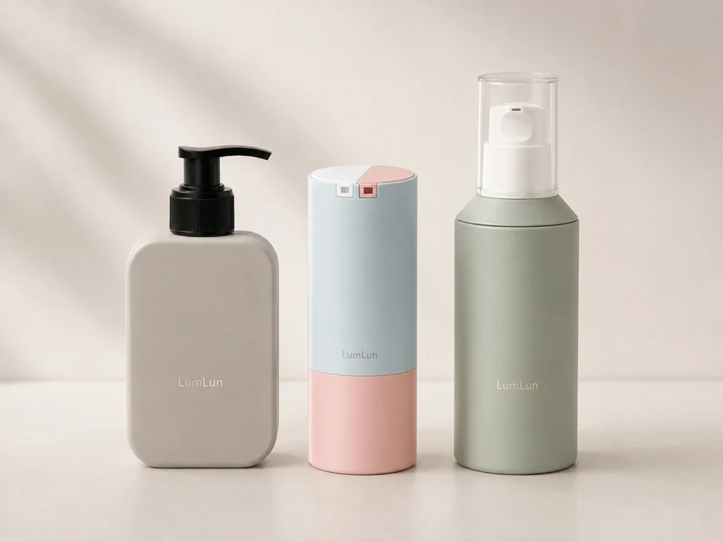
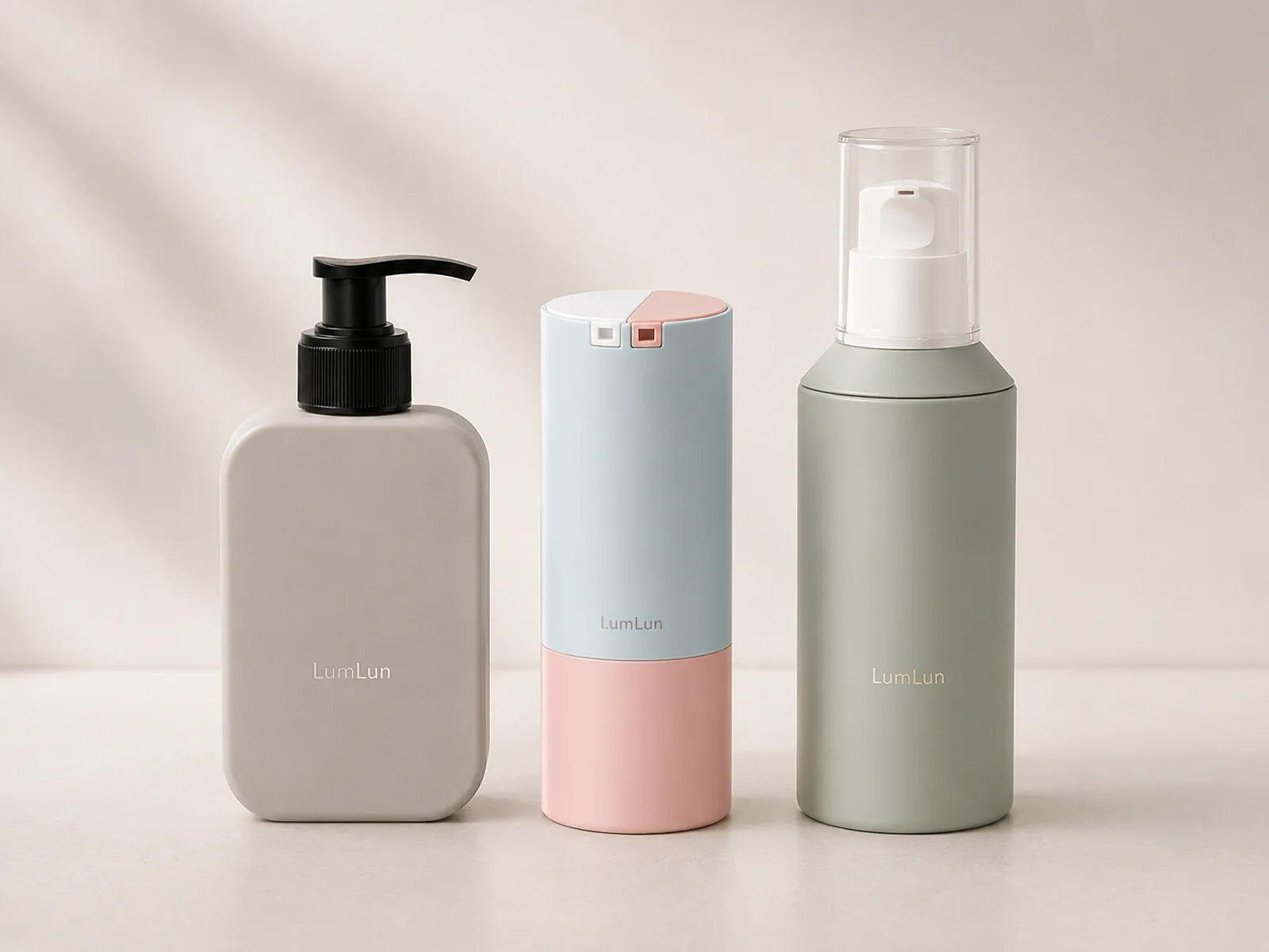
Customers usually see the body lotion bottle before they know anything about the formula. Its overall shape, pump, color and finish influence whether the product feels premium, everyday, giftable, modern or connected to a wider body-care routine.
Good body lotion packaging therefore needs to do more than hold the product. It should make the brand easier to notice and remember, help shoppers understand the intended use and create a visual system that can extend naturally to body wash, hand care and additional sizes.
Use the LumLun lotion bottle collection to compare real shapes. The guides to lotion bottle sizes and lotion pump bottle selection handle those narrower decisions separately.
Reviewed by the LumLun Packaging project team · Updated July 2026
Key Takeaways
- Use packaging to earn the first look. Bottle shape, pump and color influence whether shoppers stop at the product online or on shelf.
- Make the positioning visible. The pack should help customers understand whether the lotion is premium, everyday, giftable or treatment-led.
- Design the bottle and pump together. A mismatched dispenser can weaken an otherwise strong bottle.
- Build a system that can expand. Body lotion, wash and hand care should look related without becoming identical.
- Use existing structures strategically. Color, finish and artwork can create clear differentiation before a new mold is considered.
Decision Table
Body lotion packaging: visual strategy table
| Design decision | What it communicates | Where it matters | Responsible check |
|---|---|---|---|
| Bottle overall shape | Soft, clinical, modern, stable, generous or compact character | Thumbnail, shelf recognition and hand feel | Comfort, stability, real capacity and dispenser fit |
| Pump and collar | Daily-use convenience and visual refinement | Top overall shape, one-handed use and photography | Pump action, lock, collar finish and assembled proportions |
| Color and transparency | Formula visibility, emotional tone and range recognition | Online images, shelf blocks and gift sets | Real finish capability and artwork contrast |
| Secondary packaging | Giftability, information hierarchy and protection | Retail sets, e-commerce and launch presentation | Box dimensions, inserts, claims and total project cost |
What Should Customers Feel Before They Try the Body Lotion?
The package should make the product role clear and give customers a reason to pause before they know the formula.
An everyday lotion may need to feel approachable, generous and easy to use. A concentrated body treatment may need to feel more controlled and considered. A gift-led product may need visual refinement and a strong relationship with the carton or set. These are different design jobs even within one category.
The first impression comes from overall shape, color, pump and scale. A tall slim bottle can feel elegant. A wide stable bottle can feel generous. A thick-wall or airless structure can add visible construction and treatment cues. None is universally better; each should support the product position.
The responsible objective is to increase clarity and attraction without claiming that packaging alone guarantees sales.
Turn the Body Care Positioning Into a Clear Packaging Direction
Translate the brand brief into concrete bottle decisions: product role, routine, channel, price tier and range plan.
A useful brief says more than “premium” or “natural.” It explains whether the product is a daily family lotion, spa-style treatment, sensitive-skin moisturizer, fragrance-led product or giftable collection. That role points to capacity, dispenser, bottle scale and decoration.
Channel matters. A direct-to-consumer launch needs a strong thumbnail and transport-aware pack. Retail needs shelf recognition and a stable footprint. A gift set needs compatible height and box depth. A salon or spa product may need a larger format and repeated use.
If hand wash, hand lotion, body wash and body lotion will follow, choose a bottle language that can extend across real available models.
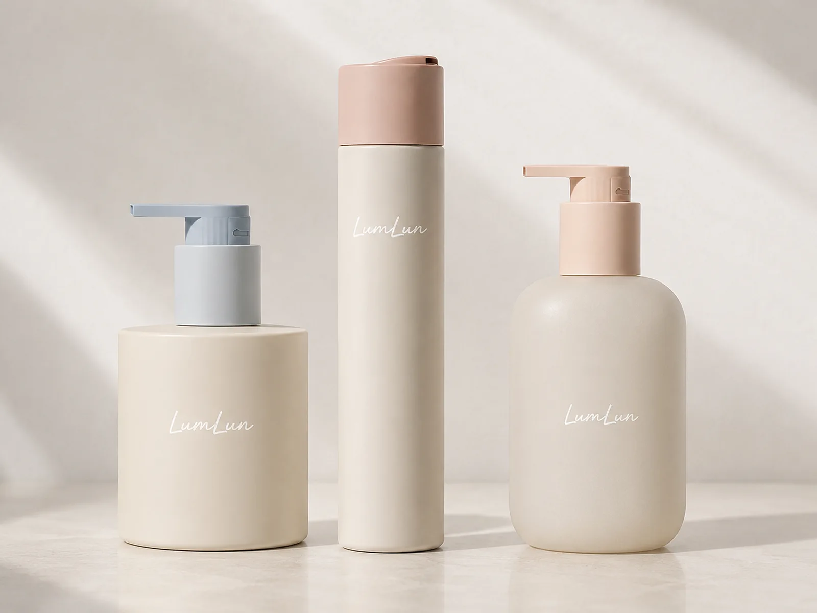
Which Bottle Shape Makes the Product Easy to Recognize?
A recognizable bottle has a clear overall shape that remains visible without relying on dense artwork.
Round cylinders are versatile and can look minimal or premium depending on shoulder, base and pump. Oval and rounded-rectangle bottles can feel softer and provide a broad panel. Square or architectural shapes can create stronger shelf blocking but need careful grip and packing review. Thick-wall and airless bodies can add visual weight.
Recognition does not require an extreme shape. A subtle shoulder, cap profile, proportion or color block can be enough when repeated across the line. Extreme novelty can increase tooling and transport complexity without useful customer value.
Compare the bottle at real scale. A rendering may hide a grip problem, unstable base or insufficient pump proportion.
How Should the Bottle, Pump and Cap Work as One Design?
The dispenser should look like the intended top of the bottle, not a generic component added at the end.
Pump head length, pump height, collar width and cap style change the overall shape. A broad bottle can support a wider pump. A tall narrow bottle may need a refined pump head and collar. A clear cap reveals the pump; an opaque cap creates a cleaner closed form.
Color-matched pumps can make the product calm and seamless. Metallic-effect collars can connect to foil or typography. Black pumps create contrast but should fit the brand rather than being accepted as the default. Lockable pumps can be useful when the real component supports the required action.
The bottle should remain stable during one-handed use, the pump head should be comfortable and the product should be easy to understand.
Send the body lotion bottle you like or a reference image. We can help identify a similar existing model and explore colors and finishes that fit your brand.
How Can Color and Finish Support the Product’s Price Position?
Color and finish should make the intended value easier to read, not attempt to manufacture value by decoration alone.
Soft matte, frosted and controlled neutral finishes can create a calm surface. Clear or translucent bottles can show the formula and liquid level. Glossy color can feel energetic. Gradient and metallic details can add differentiation when applied with restraint.
A higher price position often benefits from consistency: clean color matching, precise print, deliberate empty space and coordinated components. It does not require glass or gold. A well-executed plastic bottle can look more coherent than a glass bottle with mismatched components.
Compare LumLun finishing and customization directions only after the bottle and pump structure are realistic.
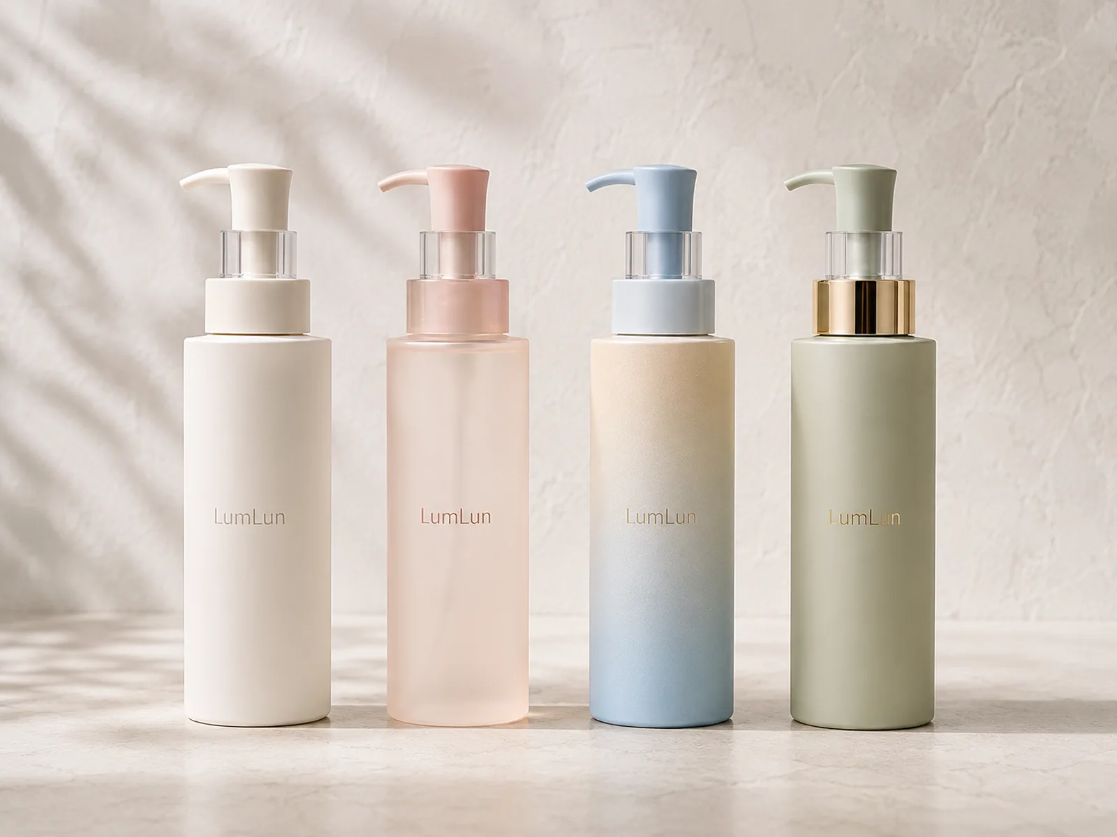
How to Create Strong Visual Appeal Without Losing Clarity
The design should attract attention and still let the customer identify the product, brand and key information quickly.
Use hierarchy. The brand, product type and one or two essential differentiators should be visible before secondary copy. Avoid filling the bottle with text simply because the front panel is large. For curved surfaces, reduce the hierarchy rather than shrinking every line.
Contrast must work on the final color and finish. A low-contrast logo may look elegant in a mock-up and disappear in a thumbnail. Transparent bottles need artwork that remains readable over the formula and dip tube.
A distinctive color block, cap shape or logo position used consistently across the range can create more recognition than a one-off illustration that cannot extend to future SKUs.
How Can the Packaging Gain More Attention Online, on Shelf and in Gift Sets?
Design for the real places where the product will be seen, not only for a close-up studio render.
Online, the overall shape and main color must remain distinct at small size. On shelf, the bottle should stand steadily and create a recognizable block beside related products. In a gift set, bottle height, pump and cap determine insert and box depth.
A larger pack can create visual presence but also dominate a set or increase shipping volume. A compact pack can look premium when the proportion and finish are deliberate, but it needs enough artwork space. The balance depends on channel and product role.
Packaging can improve the opportunity to be noticed and picked up. It should not be described as a guaranteed source of higher orders, margins or repeat purchase.
How to Build a Body Care Line Customers Can Recognize
Create one visual grammar across lotion, wash and hand-care products while letting each package fit its function.
A body lotion and hand wash may use different pumps or capacities but share the same color family, logo position, collar tone and typography. A hand cream tube can use the same finish and cap accent without copying the bottle shape.
Use SKU differences deliberately. Product types can be distinguished by color, label band, cap or secondary copy, while the master brand remains stable. Size tiers should be related but not so similar that customers cannot tell them apart.
Plan the future line before finalizing the first package and check whether the selected family offers the capacities and companion formats needed.
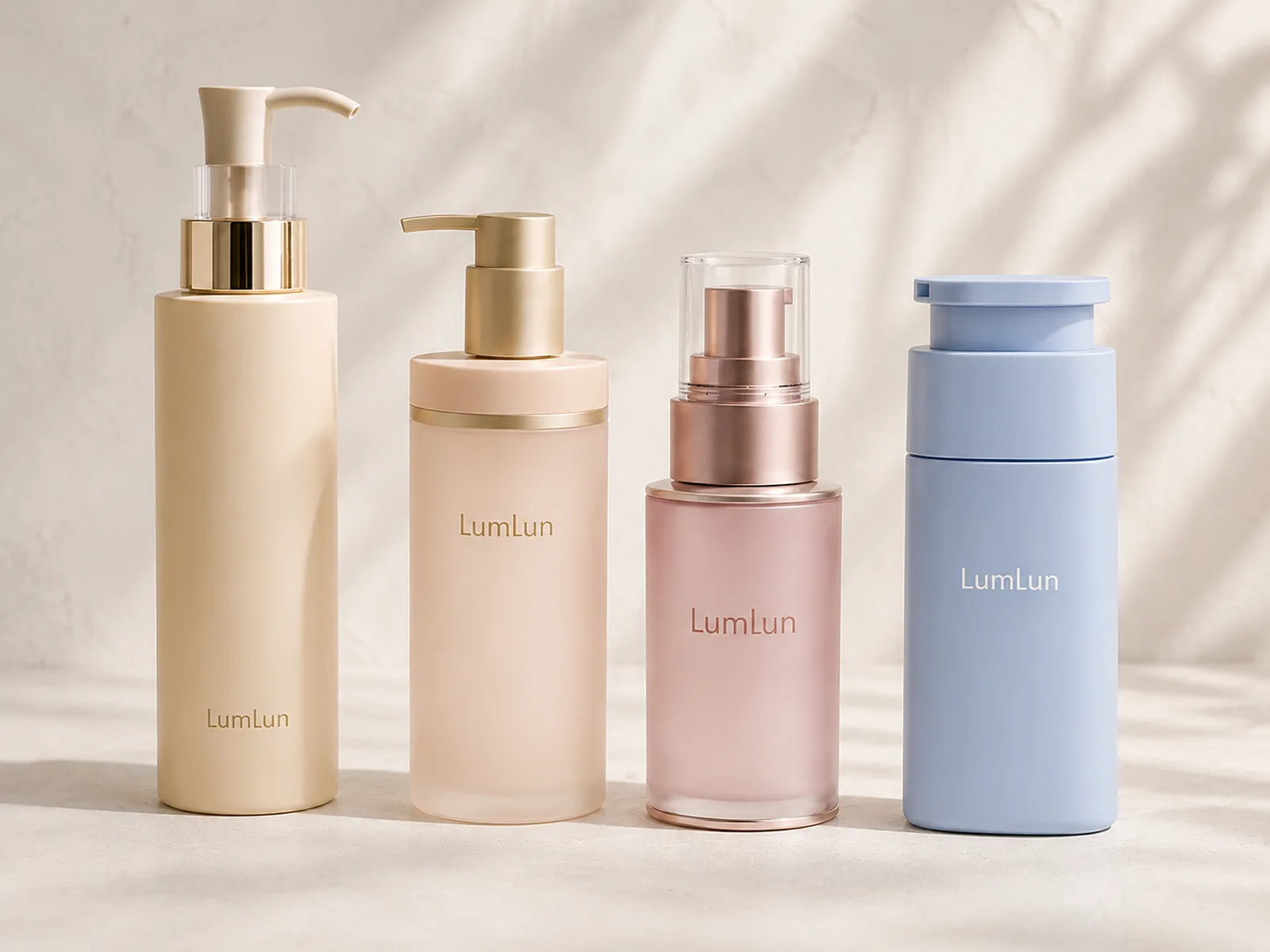
Existing Bottle, Similar Option or Custom Mold?
Most differentiation can begin with the right existing model and a strong decoration system; custom tooling is for structure that must be unique.
An existing bottle can be customized in color, finish, print and compatible component options. A reference image can often be matched to a similar overall shape and adapted to the brand. This route keeps the project grounded in a real structure.
A custom mold becomes relevant when the overall shape, dimensions, shoulder, base or dispensing format must be reproduced closely and no existing product is acceptable. It should be evaluated for cost, order scale and time as a separate decision.
LumLun can begin with a product image, explain what is structural and what is decorative, and shortlist the most realistic route without asking the client to decide on tooling first.
Which Body Lotion Packaging Direction Fits Your Brand?
Choose the package that best connects the product routine, visual position, channel and future range.
For a broad everyday line, a well-proportioned lotion pump with a clear brand system may be the strongest answer. For a concentrated treatment, an airless or thick-wall direction may fit when the formula and capacity support it. For portable hand-and-body care, a tube or compact pump may make more sense.
Compare actual models, not abstract labels such as “premium bottle.” Review assembled proportions, color zones, pump and cap, front-panel space and secondary packaging. Then select the finish that expresses the brand without unnecessary complexity.
A successful direction is easy for customers to recognize, comfortable to use and realistic for the project.
Decision Table
Which body lotion packaging direction fits the brand?
| Brand direction | Bottle starting point | Decoration direction | Why it may work |
|---|---|---|---|
| Minimal everyday care | Simple round or oval lotion pump bottle | Matte or soft gloss, clear hierarchy and color-matched pump | Easy to understand, scalable and suitable for a broad range |
| Premium treatment body care | Thick-wall, airless or refined cylinder where appropriate | Frosted, controlled metallic accents and restrained artwork | Creates a deliberate treatment presentation when the product supports it |
| Calm lifestyle | Rounded overall shape or softly proportioned pump bottle | Warm neutral, sage, translucent or tactile finish | Connects color and form to a relaxed routine |
| Gift-led collection | Coordinated bottle family with compatible box dimensions | Shared palette, logo position and product hierarchy | Makes the set feel intentional and recognizable |
Final Recommendation
Start with the body-lotion position and customer routine, then choose a recognizable bottle overall shape and coordinated dispenser. Use color, finish and artwork to make the product easy to identify online, on shelf and in a set. A premium result can be achieved with an existing plastic, thick-wall or airless model when the proportions and execution are strong; custom tooling is only needed when the structure itself must be unique.
Frequently Asked Questions
What makes body lotion packaging look premium?
Balanced proportions, a coherent pump and bottle, controlled color, precise logo placement, appropriate finish and a coordinated carton or product range create premium appearance.
Which bottle shape works well for body lotion?
Tall cylinders, wide rounded bottles and rectangular bottles can all work. The right shape depends on capacity, stability, pump proportion, brand position and the desired shelf overall shape.
Does premium body lotion packaging need glass?
No. Plastic bottles can look premium through wall design, weight, surface finish, color, pump details and high-quality decoration.
Which finishes suit body lotion bottles?
Matte, glossy, frosted, gradient, silk-screen, hot-stamp and metallized details can all work when they fit the selected material and visual direction.
When is a custom bottle mold worth considering?
Consider custom tooling when an exact overall shape or structural feature is essential and no existing model supports the brief. Existing structures should normally be reviewed first.
BODY LOTION OPTIONS
Compare Body Lotion Packaging Options
Browse LumLun lotion bottles or send the packaging you like. We can begin with the visual style and approximate capacity, then discuss the remaining details later.